

Backgrounds are a colorful way to add some flair to your website, and you can find them in almost every design. While applying a background is easy, there are a few settings that come into play. Understanding how each of these settings affect the design, allows you to make the most out of this simple, yet powerful feature.
Background color
Background color allows you to specify a solid color to the selected layout component. You can apply one by clicking the color box control and then choose any color from the spectrum. You can also manually enter the HEX, RGB, and HSB values.
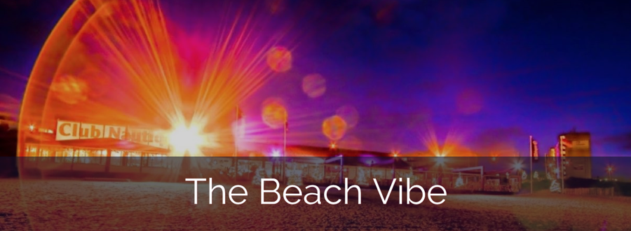
Another feature found in the color box control is the opacity (the box labeled a in the lower right corner). This allows you to make the color transparent creating some cool visual effects. As you can see in the example below, the background color of the header “The Beach Vibe” has a see-through effect. The opaque effect is created by changing the opacity value to 0.60. The lower the value, the more transparent the background will become.
Clip
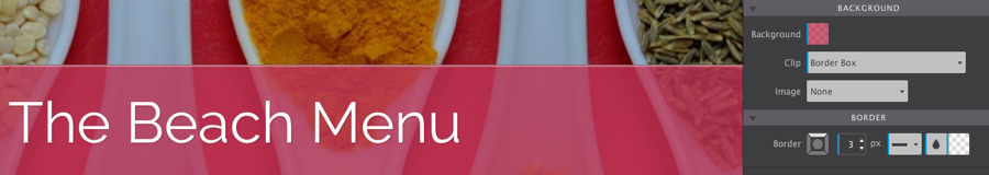
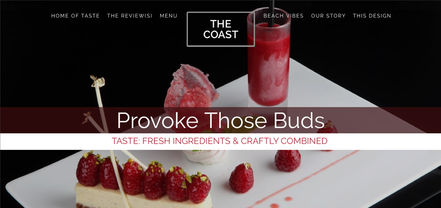
The background clip property allows you to control how far the image or color will extend beyond an element’s content or padding. Border box allows the background to extend to the outside edge of an element’s border. Take notice that the border’s opacity is 0.3 and now takes on the background color.
Padding-box clips the background on the outside edge of the element's padding and does not extend to the element’s border. As shown below, the border is a see through white color and does not take on the background color as it would if you had chosen border box. This property is useful when you wish your border color to have an opaque look but still retain its supplied color.

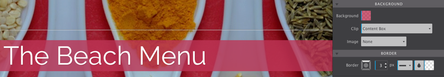
Content box allows you to clip the background at the edge of the content box. This example shows that the background only applies to the content, it does not fill to the borders.
Image
The image dropdown allows you to specify what type of background you would like to apply to the selected element. Choosing none, means no background image will be used (this is also how you remove a background image). Resource allows you to select a file from your local project files, whereas using URL you can specify an image located online. When you select either resource or URL, you are given several options to choose from.
Position determines where the image or gradient is placed in its container using the vertical and horizontal dropdowns. You can select custom to adjust the position of the background manually.
Repeat allows you to specify how a background will repeat itself. The default is set to repeat which tiles the background in both directions ( the X and Y settings). If you would like to repeat images horizontally, use repeat-x or if vertically, use repeat-y. To have the background only display once, use the no-repeat value.
Size
The size control can be used to specify the size of background images. The values that can be used are contain, cover or custom. Contain specifies that a background image should scale as large as possible while retaining the dimensions (width and height ratio) of the image.
To tell the browser to cover the entire container, on the other hand, you would use cover. Just note that if the image is smaller than the container itself, it can cause the image to stretch and become distorted.
Custom lets you control the backgrounds width and height manually using the X (width) and the Y (height) values.
Origin
The origin property defines whether or not the background gets painted across the entire element, inside the border or the padding. This control is much like the clip settings (described above).
Attachment
The attachment property specifies how the background moves in the browser or viewport when scrolled. There are three values that provide different options for displaying the background itself. Scroll is the default value and scrolls with the main view but stays fixed on the local view. Whereas fixed stays fixed on the viewport and your perspective changes as you scroll around the page. Using local, on the other hand, will scroll the background along with the element's content. You can learn more on how to create a cool fixed background effect by visiting our Fixed Background article. Still a little fuzzy on how attachment works? Download the project below to clear things up!
Background Fixed Support
One thing to keep in mind is that iOS Safari has some unexpected behavior when using the fixed value. One workaround to this would be to change the attachment to scroll once you reach a tablet breakpoint or to be safe, around 1024px. You can also use Skrollr, which is a Javascript option to correct this issue.
Linear Gradient
Using gradients rather than images allows for better performance of your website. Because you are using CSS instead of images, this saves bandwidth and HTTP requests, making the page load faster. Learn more about how your website stacks up using our Website Insight app!
Gradients start with one color and gently fade into one or more color variations. Using the supplied controls, you can sway the direction and where the color change happens. The degree represents the starting point of the gradient, specified with values between 0 and 360 degrees. Changing the degree of the gradient changes the direction in which the color flows. Color stops assign a specific color to the location along the gradient line. This location can be specified by entering a number from 0 (the starting point) to 100 (the ending point). Using a gradient means that you can select one color for each of the stop values to achieve the desired effect.
A gradient has many uses as it can be applied to pretty much everything. One way to use them is to spruce up a button so that you can transform a flat looking button to something quite stylish. As an example, below, there are two buttons, the left button has a color of #466368 and the right has a gradient with two colors applied, using #648880 and #293f50.

With all the options that the background property provides there are almost endless possibilities. Code well my friends!