

The Design Pane
Email design is different from web design
Before you start designing your newsletter or email, or start tweaking one of the themes, it is important to realize that designing an HTML email is nothing like building for the modern web. While web browsers (mostly) adhere to web standards and use the same display rules, the opposite is true for mail clients. Without the proper tweaks and precautions, automagically added by RED, even Outlook.com would display emails differently than desktop relatives like Outlook 2010/13.
To increase display consistency, HTML emails are constructed from a series of nested tables and inline CSS, often supplemented with HTML attributes and conditional display rules. But although this is very unlike modern web design, RED does an amazing job in making it seem that way. The editing environment looks and feels like you are designing a website in a browser!
The editing and live preview area resembles a website, and the controls are very similar to Responsive Layout Maker (and the upcoming Responsive Site Designer). The email client specific code that reinforces display consistency is added upon exporting or sending by the unique Email Code Generator (ECG). The scripts used by ECG are frequently updated, and reloaded by RED when possible. Although this makes the emails display as consistent as possible across the various email clients, there are things that certain email clients simply can’t do though. Slight differences are to be expected.
Improving the User Experience for supporting email clients.
RED for Business uses the design principle of progressive enhancement to create better user experiences for supporting email clients. In that case more significant differences between clients (that do or do not support that specific code) can be expected. RED contains a number of tool tips that describe the expected results, an overview can be found here.
Applying and Sharing Styles
The design of each element can be customized by selecting the element and then navigating to the Design Pane. Double clicking an element will bring up the design pane as well. Styles can be applied to the selected element or to all elements of the same type. To define a style for all elements, select ‘Apply to all’ from the drop down. These edits will show a pink line. Controls that define styles for a specific element show an orange line.
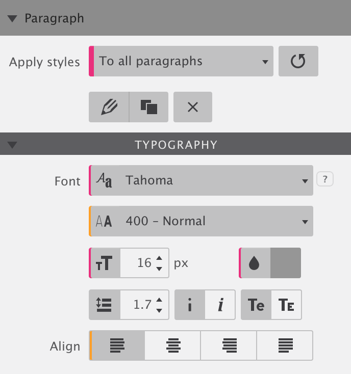
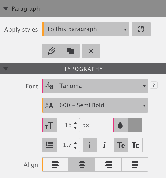
Specific changes (orange) are stronger than general changes (pink). This means that the font-weight (400 - Normal) and align (left) that show in the left image will not apply. They show the orange line and will be overridden by the more specific style settings in the image on the right
The best workflow is to start with a definition of the general, global styles, and make the individual, element specific, changes later. Elements can also be cloned through duplicating or copy & paste. In that case, a change to an orange setting will apply to all cloned elements. This comes handy when a specific variation of an element is used in more places throughout the design.
Modern email design with Classes and IDs in RED for Business.
Resembling a front end web design workflow, RED for Business works slightly differently. Styles can be applied to 3 different selectors, from least to most specific these are the element type (pink), the class (blue) and the ID (orange). Styles defined for the type apply to all elements of that type. They can be over overridden by styles applied the class or ID. Classes can be shared by elements of the same type. IDs are unique to an individual element.
Defining Styles
Depending on the selected element type, a series of different design controls is available. For all elements things as the width, padding and alignment can be controlled. But typographic tools are, for example, only available for text elements. Image elements have specific tools for selecting local images, or linking to online images.
Typography
With about half of the images being blocked on the first open of an email, it's the text has to do most of the initial heavy lifting. Choosing interesting, attention grabbing text for the headers and opening paragraph is important. But before they are actually being read, the typography already made an impression on the recipient. The typeface, font size and color(s), and the arrangement already transmit information about the intent and contents of the email.
Typography requires attention to detail and RED offers the tools to do so. Here’s an overview:
Font family — The typeface that the text is intended to be displayed in by the email client. Unfortunately the @font face property is not widely supported by email clients (in sharp contrast to browser), limiting the choice for most situations to a web safe font. RED Personal contains all fonts that are widely supported, with Arial, Arial Black, Book Antiqua, Comic Sans, Courier New, Geneva, Georgia, Helvetica, Impact, Lucida, Lucida Grande, Monaco, Palatino, Tahoma, Times, Times New Roman, Trebuchet MS, and Verdana being the safest choices.
Web font support in RED for Business.
RED for Business includes Google Font integration (supported by Apple Mail, iOS mail clients, Thunderbird) with the option to choose a web safe fall back font. Since different type faces take up different amounts of space, texts may wrap differently depending on the font rendered.
Other controls in RED for Business that can enhance a design include background images and gradients, border radius, box shadow, and a few others. Practical examples of how these controls can be used to improve email designs for supporting email clients can be found in this article.
Font weight, size and color — The font weight control is by default set to normal. With this control the text can be made ‘heavier’ (more bold) or lighter. Font size and color are self explanatory.
Line-height, italic, small caps — The line-height controls the space above and below the text elements. For good readability a line-height of 1.4 or higher is recommended for paragraphs. Texts can also set to be in Italic or small caps.
Text align — Texts can be left aligned, centered, right aligned or justified. The alignment is often changed to ‘center’ for small, mobile, screens. We will talk about this more in the next chapter.
Transform — Controls the capitalization of the text. The first option, capitalize, transforms the first character of each word to uppercase. The second option makes all characters display lowercase while the last option sets all characters to display uppercase.
Decoration — There are three options, one for underlining, one for overlining, and one for a strike-through. Press the X to remove text decoration.
Spacing — The first line of a block of text can be indented. This is usually done to clearly mark the start of a new paragraph. Adding space between letters (letter spacing) can aid legibility. Additional spacing can also be used to create special effects like stretching headlines or two pieces of text spaced out to be the same length. The figure below shows an example of the latter.
Inline Text Styling
The typography controls on the design pane apply the styles to all the text in the element. However, styles can be applied to specific words, or even individual letters, as well. The text and style editor can launched by clicking on the pencil in the design pane. The design pane will disappear and the editing toolbar will be visible above the preview and edit area. The figure below shows this. The cool thing about the below (typographic) design is that all elements always immediately display on open, whether the client blocks graphics or not. It is a really effective way to get the core message across, which can be then enhanced with images.
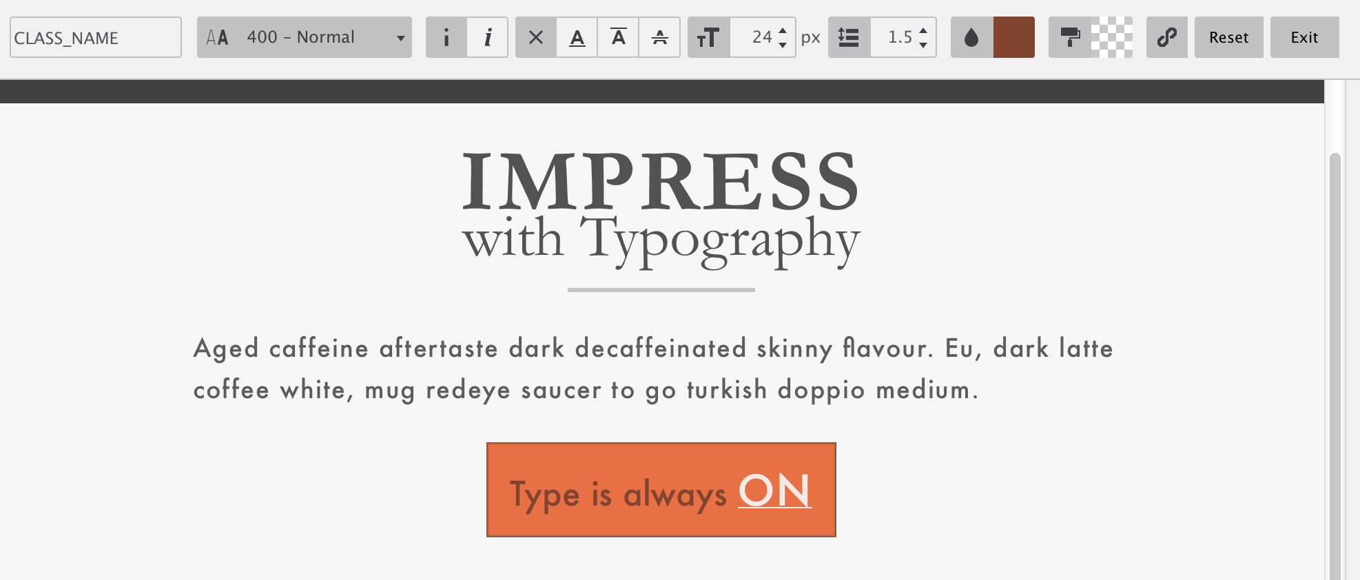
The ‘text edit’ mode can also be initialized by right-clicking and selecting the edit option, or by triple clicking any text element. You can exit the edit mode by clicking anywhere outside of the element, or by pressing the exit button on the right. The reset button next to it removes all styles settings from the selected text.
The controls in the editor are very similar to those discussed in the typography section. Font-weight, italic, font-size and so on, they all work in the exact same way as discussed above. However, in this case, the styles will only apply to the selected text. The editor does offer a few additional options.
Type a class name — Each edit can be given a name. This makes it easy to reuse the exact same style settings throughout the email design. Simply select the word or words that you want to apply an existing styles too, then type the name of the style in the top left box. When the cursor leaves the box (hit the tab key or click anywhere) the style will be visible. Hold on now, it gets even cooler than this!
In case the inline styles need to be adjusted, they can all be edited at the same time. Simply select any of the occurrences, edit anything, and the styles will be consistently applied throughout the entire design. No need to, for example, laboriously change text links one at a time. Selecting and tweaking one link, changes all links that have the same class name. Now that’s a time saver! Speaking about links...
Adding text links —Click the chain button to turn the selected text into a link. A window will popup where the URL can be pasted or typed. At first, the link will get a light blue color, but using the controls in editor toolbar, the link appearance can be changed to anything you like.
Appearance
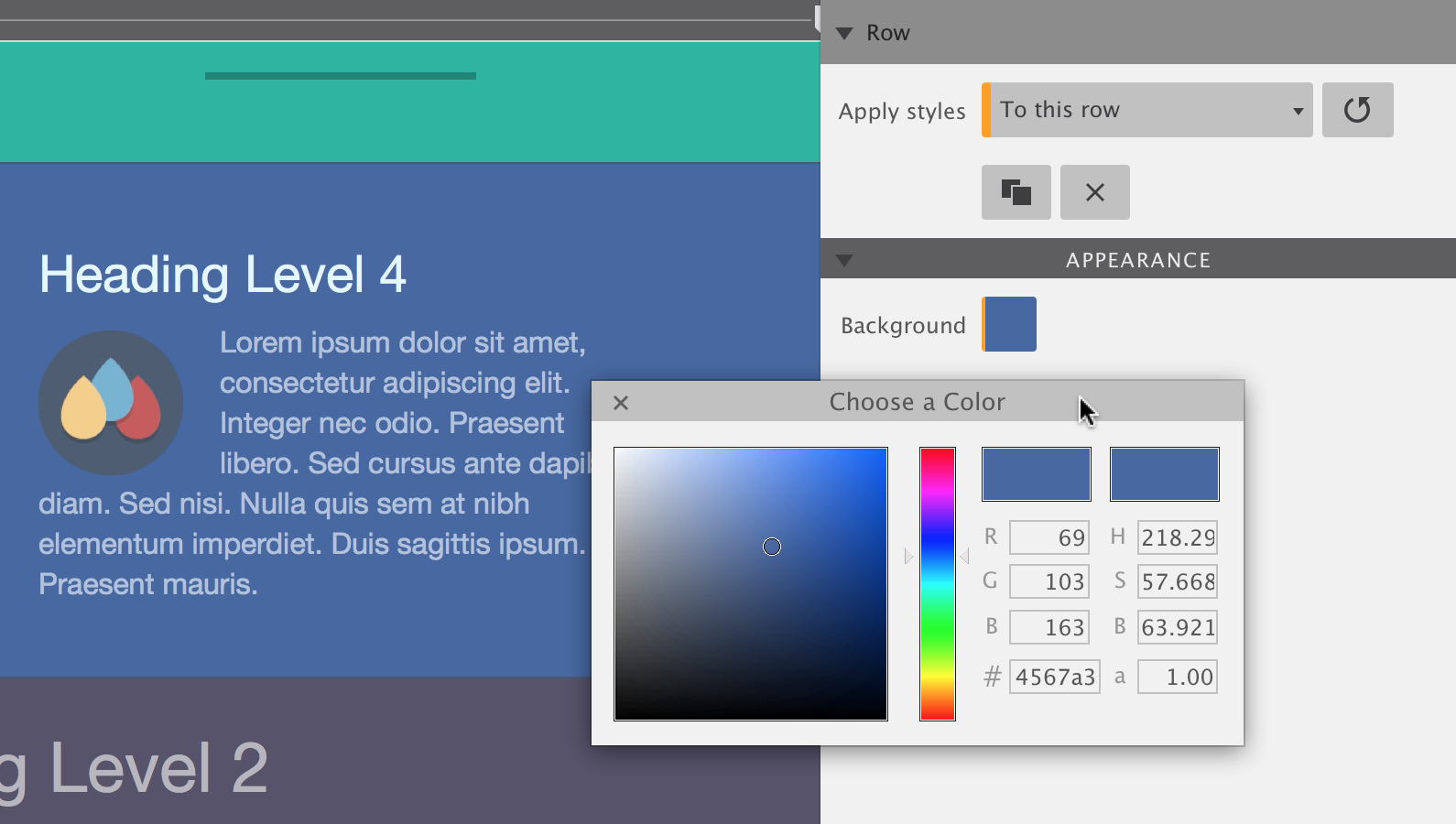
The appearance section on the design pane presents tools to manage the background (color), borders, and element position. The controls displayed are contextual to the selected element. Borders can, for example, not be applied to rows. Here’s an overview and description of the appearance controls:
Width —Defines the width of the element, relative to its parent element. When the ‘auto’ box is checked, the element will only take up the space that is needed for the content. A paragraph with only a few words, will only take up enough space to fit those words.
Align —Positions the element to the left, right or center of the parent element.
Padding —Creates space around the content of the element. For example, an image with a green background and 10px of top padding, will show a green 10px line above the image.
Background —Pops up dialog for specifying the background color of the element.
Border —Pops up dialog for specifying the background color of the element.