

Working with the Picture element
Ahhhh the mighty picture element. Arguably one of the most important features of a website. Pictures, graphics, and logos - this type of content is important for setting the website’s visual character.
In this article we will cover the following topics:
- What is the Picture element
- Image Optimization
- Using the Picture element in Site Designer
- How to swap out image sources at a breakpoint
- Picture element vs Background Images
What is the picture element
This powerful element is more than just showcasing your stunning images. It can be used as a placeholder when creating a wireframe, or configured as a link. Plus it is smart enough to be told to change its appearance based on their viewer’s screen size or device.
You see most website images are formatted for desktop viewers with a high resolution to make them look sharp and crisp. However, these images are typically too large for mobile phones and tablet users. If the file size is enormous, you’ll end up punishing mobile viewers by making them eat up precious bandwidth to download it to their device. No Bueno!
Another common occurrence happens when big pictures with lots of details are sized down on a smaller screen. All of the intricacies of the image are lost due it becoming too squished in dimensions. Yea, you could try squinting real hard or zooming-in with your fingers, but that’s an effort most viewers are not willing to take and goes against the principles of responsive design. Using cropped, optimized versions of the image to suit various layout changes would be the ideal way to go.
Using the picture element helps to resolve these kinds of design issues. Supported by most modern and mobile browsers, the viewer’s browser selects the appropriate version of the image from your resources (say a ginormous overview picture for desktop and a cropped image with smaller file size for mobile) delivering the friendliest version suited for each viewer and their available screen size. A cute, interactive example is displayed below. Resize your browser to see the cat adapt to the viewport.

Picture Element Support
The picture element is not supported by all browser vendors (yet). However, RSD creates universal support using a polyfill. This means that as long Javascript is enabled, the picture element will work as explained above, even if the browser does not natively support it. For the very few that use the web without Javascript and use a non-supporting browser, the default image will be displayed.
Image Optimization
It’s true guys size does matter...when it comes to image file size that is. It’s good practice to design for performance and use images that are lightweight. This is especially true when your site uses many images as you want the load time to be as speedy as possible. Optimizing images is the process of decreasing their file size. Site Designer will warn you anytime you add a resource that is larger than 1MB (and that’s too big really), reminding you to optimize that file.
Several factors can be considered to determine the optimal settings for your images. The most important are the file format (GIF, PNG, JPEG), image quality, and pixel dimensions.
Resizing the image to the appropriate dimensions will cut down the file size a lot. This along with choosing the best-suited file format for your needs. For example, JPEGs, which are the most common file format for pictures, are ideal for creating a good balance between file size and image quality. The PNG format is used when transparency is needed, usually for vector drawings such as logos. While GIFs are the format of choice when making animations.
Do you have images with text encoded on them? Reconsider your choice and see if you can recreate a similar look using the CSS controls with cool typography. This not only eliminates the need to download heavy pics but is more user-friendly making the text selectable, searchable and accessible to screen readers.
There are lots of compression tools out on the web that can help you bring the kb’s down on your images making them more light-weight for your guests. One of our favorites is Pixelmator as it allows you to resize the image, choose the right file type and when you export for the web it provides a cool slider to adjust the image quality. For all you Windows peeps, FileOptimizer is a great choice.
Using the Picture element in Site Designer
First make sure that you start with your slider at the default breakpoint for your project workflow. Your layout and style choices will then be set as the standard. Later you can adjust throughout the different breakpoints.
From the Content pane, click or drag and drop a Picture or Picture Link element onto the canvas. A ‘Picture’ placeholder graphic will appear until a resource is configured. To do so, go to the Element pane > Selected Element Properties > Picture and use the drop down to choose a Local or Online Image Source.
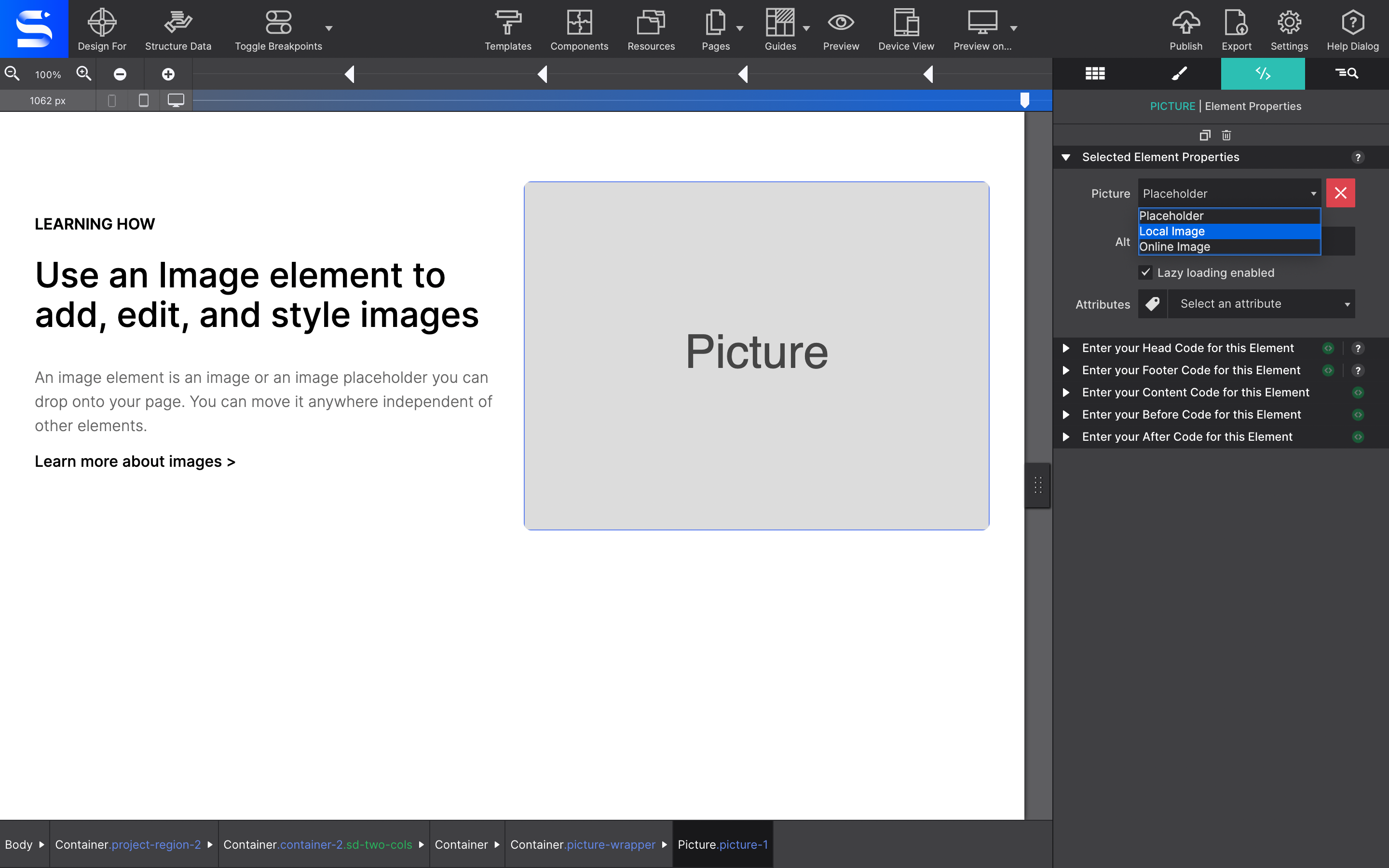
If you select a local image, the Resource dialog window will appear where you can import local graphics to the project file. Organize your images into folders for easier maintenance. Once you have selected your image source the graphic will appear on the canvas.
Under the Element pane > Selected Element Properties you are presented with a few additional configurations. The ALT box allows you to set alternative text. This bit of text would be displayed for the viewer if the graphics fail to load on their screen. This is very important for accessibility as the ATL text is used by screen readers.
The Lazy Loading checkbox is a killer feature for picture-heavy pages. Lazy loading is the practice of delaying load of resources or objects until they're actually needed to improve performance and save system resources. So instead of loading them at the start, they will load whenever the user scrolls them into view. Your page speed will increase tenfold.
To manage the Picture element positioning, you would go to the Style pane > Layout. Positions controls range from the common Block and Inline Block, or use Flexbox or CSS Grid to place it in a specific part of your page.
Under the Dimensions section you may alter the actual size of your Picture element such as width and height. One common layout method is to center the Picture. This would be done when a Display: Block Picture element has both the Right and Left Margin set to Auto.
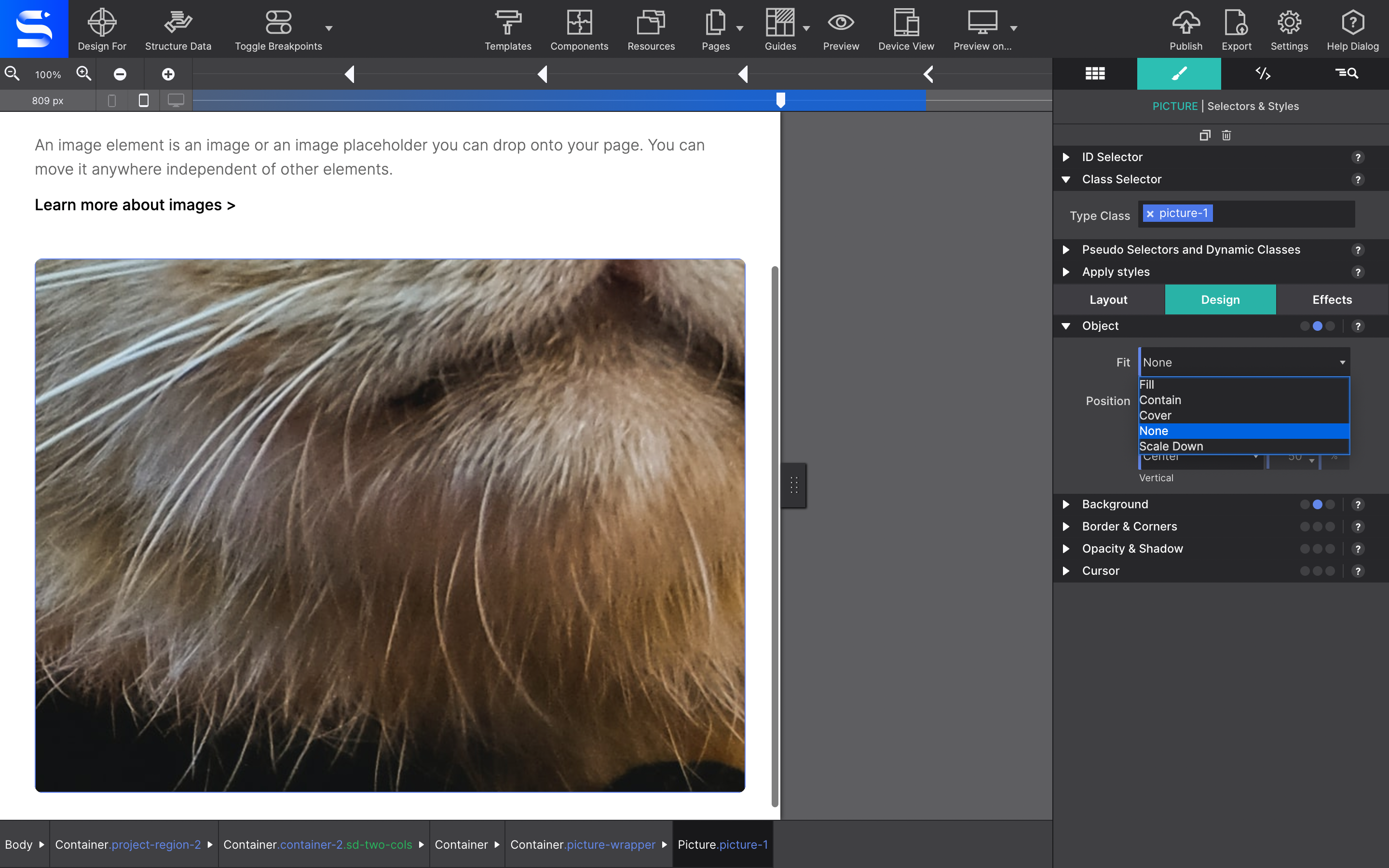
To tweak the positioning of the image within the element, use the Object CSS controls on the Styles pane > Design > Object section.
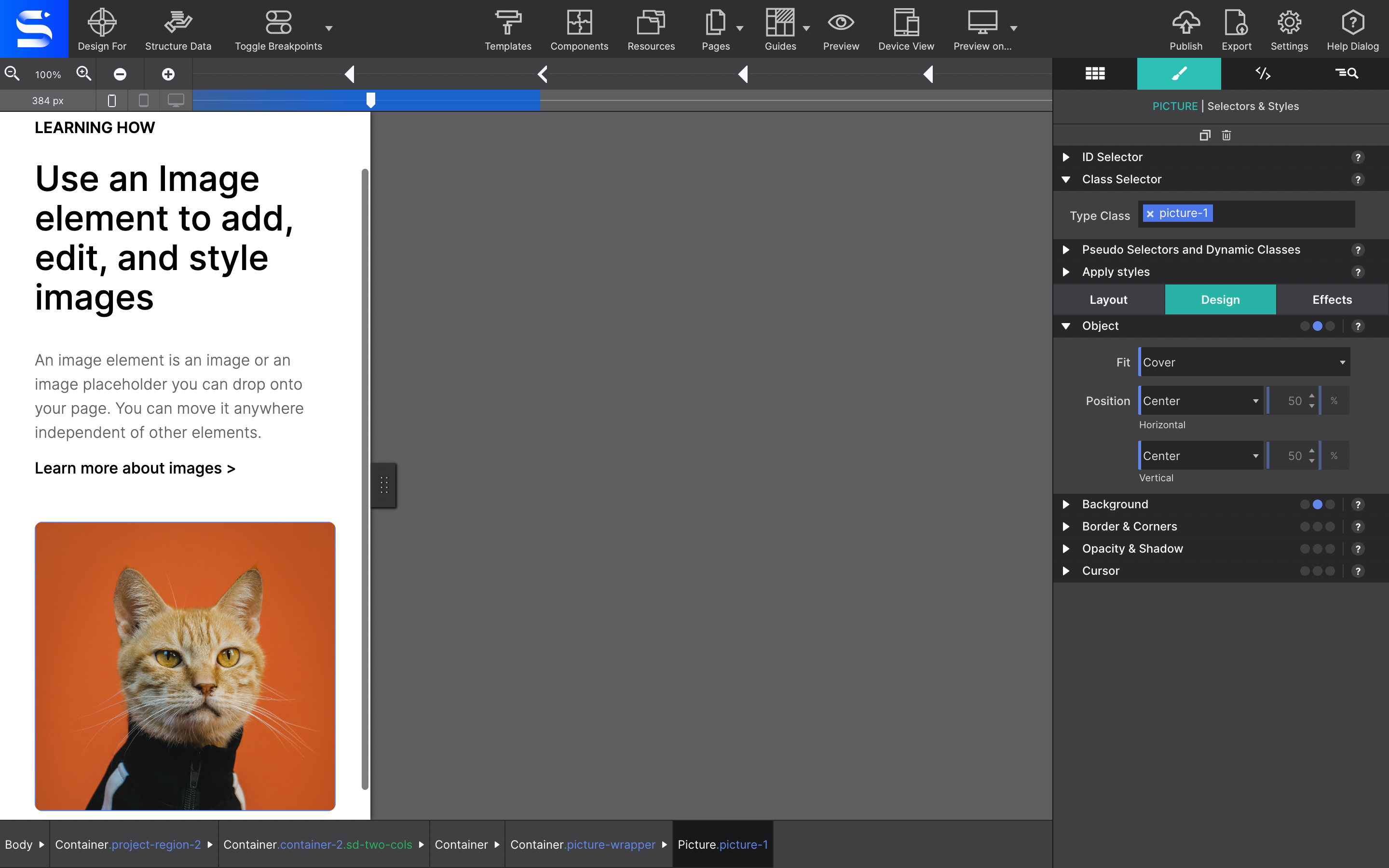
These controls allow the image to auto-fill its container without losing its aspect ratio. No more hacks to fix distorted or cut off images. There are several values for implementing this handy method for scaling and cropping images. Note that you may need to specify some width and height to the image, and change its position to be absolute in order to stretch the image/ in its container.
The Fill value will allow the object to completely fill the container. If the image's aspect ratio does not match the aspect ratio of its container then the image will be stretched.
Selecting the Contain value will allow the image to fill the container while preserving its aspect ratio. The image will become letterboxed in the container if its aspect ratio does not match its container.
The Cover value will size the image to maintain its aspect ratio while filling the element’s entire container, clipping the graphic if the ratio does not match.
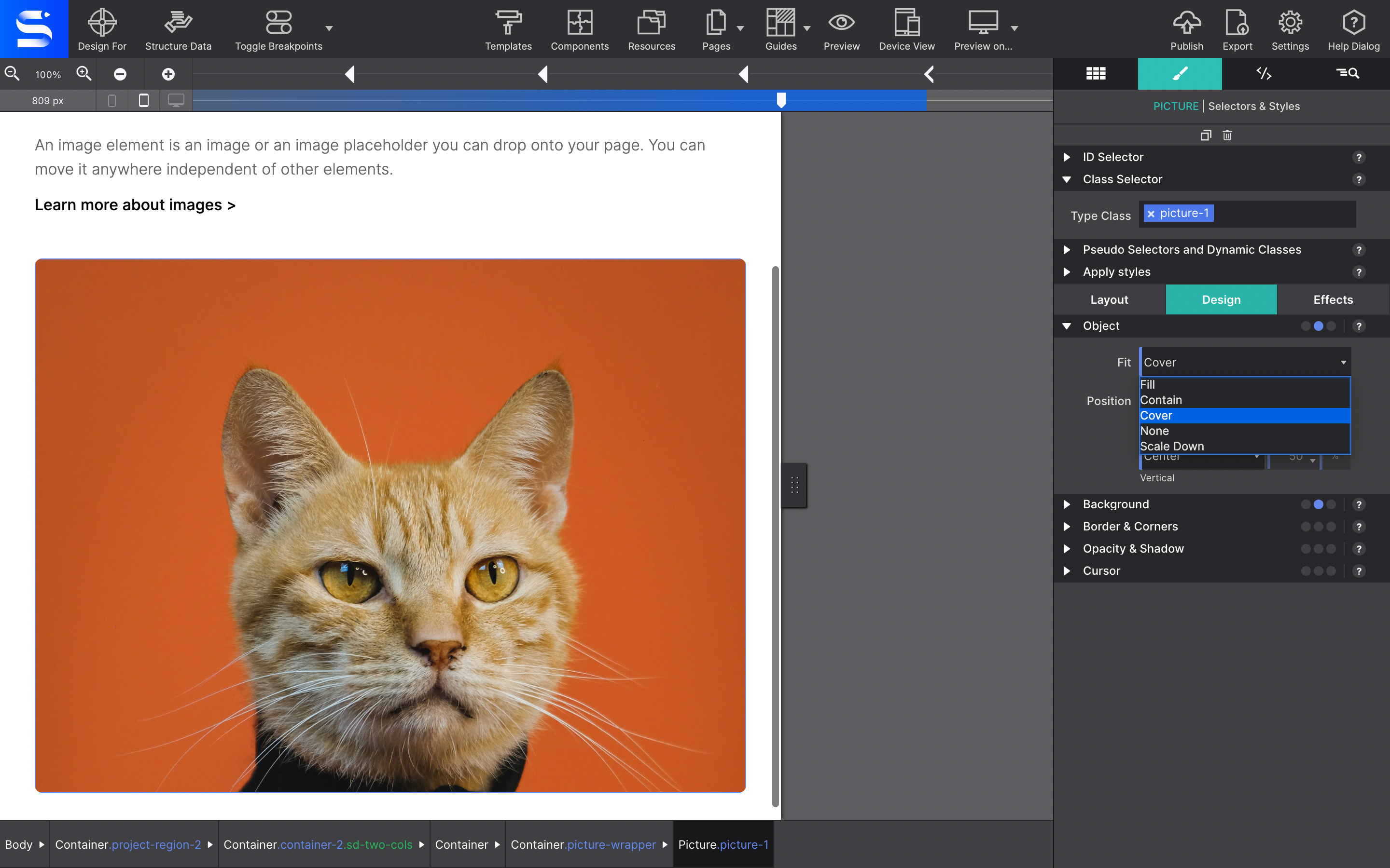
The Scale Down option will shrink the image in the container. Choosing None will not resize the item.
Swap out images at a breakpoint
The real magic happens at the breakpoints. Breakpoints, represented by the little dots above the slider, are used when design adjustments are needed to accommodate for different display widths. Using the viewport slider at the top, you see how the image resizes to fit the display widths when you slide. The device gages at the top left indicates an estimate of the corresponding device type for that size screen. Considering the huge overlap in device sizes this is merely a reference point while you tweak your design.
With your image in place you can now tweak it at breakpoints. Load in smaller, optimized versions of the file, or cropped version for mobile viewers which focus on the most important aspect of the picture. To do this, move the viewport slider to the desired breakpoint. Then go to the Element pane > Picture and use the drop down to choose a new source file.
Rinse and repeat for any breakpoint/viewport size you want to alter.
Picture element vs Background Images
This is one of the most common questions we get with regards to pictures. Yup, we often see people attempt to use the picture element and make it stretch as a backdrop. However, for background, you actually would not use the picture element. Instead, the image would be configured on the background of a Container or Body thus allowing content elements (headers, paragraphs, other pictures, etc.) to be placed on top of it.
The Background Image controls are located on the Styles pane > Design > Background. Learn more about the background image styling property in the Site Designer guide.
Level up with the Site Designer help guide.
Site Designer gives you the power to work with CSS visually. These code-free controls allows you to experiment with new styles and layouts without having to be a pro at hand coding. Discover the power of Site Designer and start dragging, droppping, clicking, and sliding your way to an epic website.