

Layout Maker Pro Template Pack
Looking for inspiration on how to create a responsive layout? If so, then we got you covered! Here we have put together an awesome bundle of responsive layouts that you can use to get started on building your responsive website. You can use these layouts and just add your own content to them or use them as a way to learn how to make the most of Responsive Layout Maker Pro.
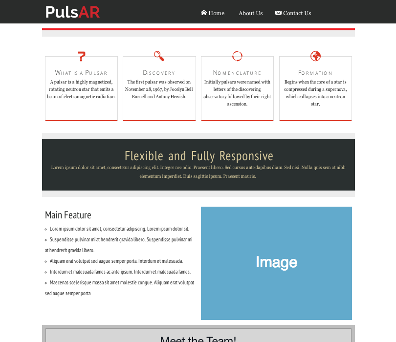
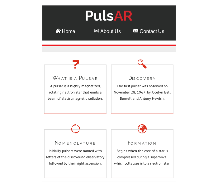
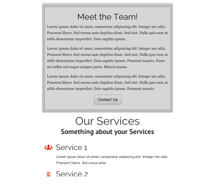
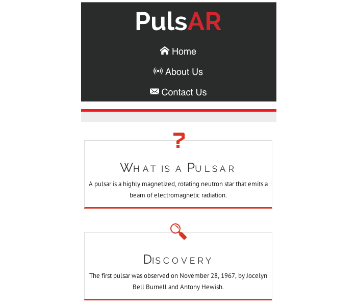
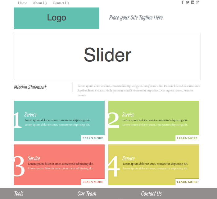
Pulsar Layout
See the Pulsar template in action! As the display view gets smaller, the layout adjusts for a better fit:
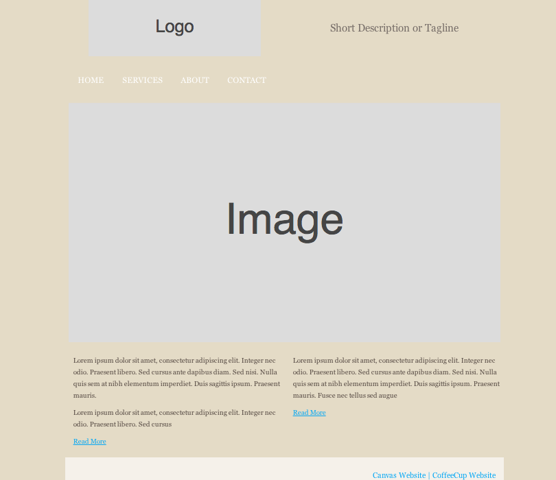
Desktop View:
Tablet View (top of layout):
Tablet View (bottom of layout):
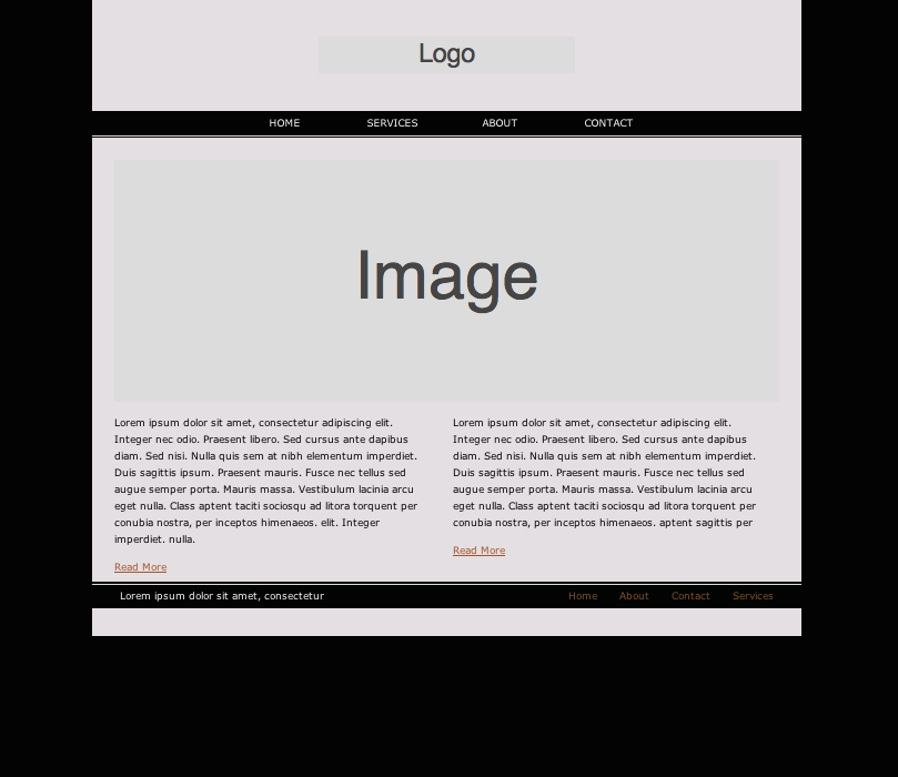
Mobile View:
See Pulsar layout in action!
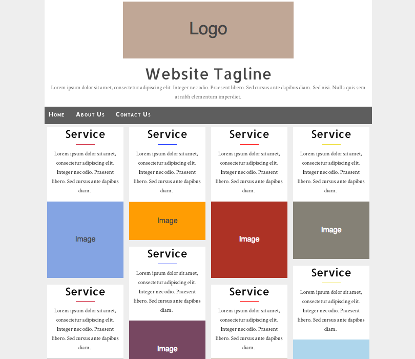
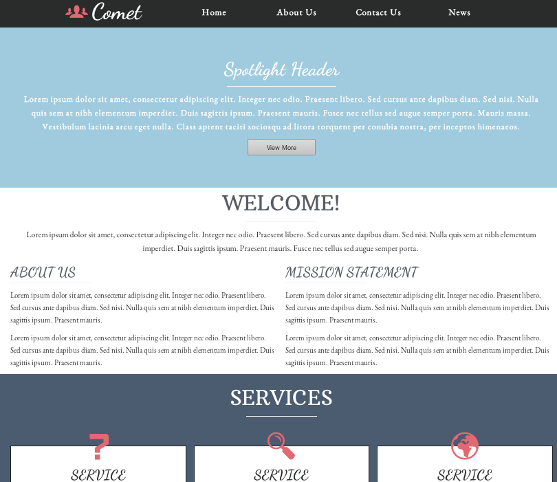
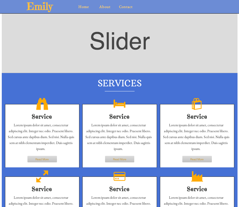
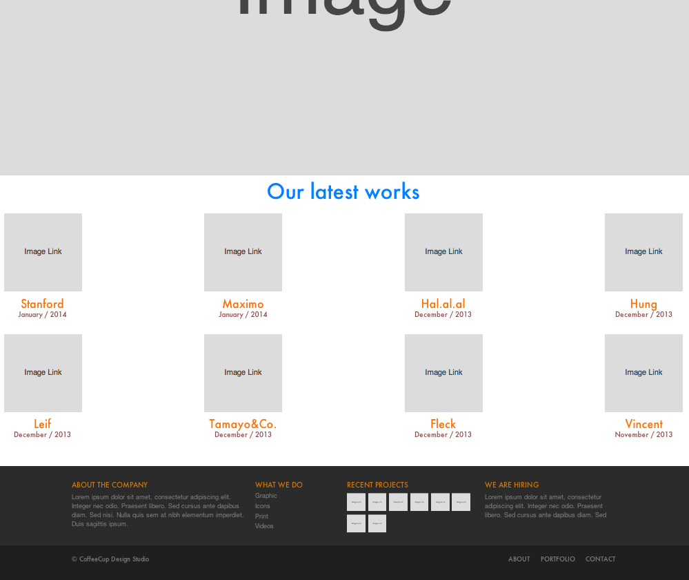
All our Layouts
Just like our Pulsar demo above, each layout comes with Desktop, Tablet and mobile phone views which insures it will display correctly on any device.
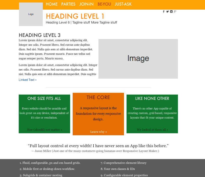
Be You:
Simple:
Milkyway:

Essential:

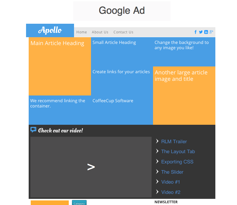
Apollo:
Quick Starter:
Card:
Comet:
Emily:
Vertical:

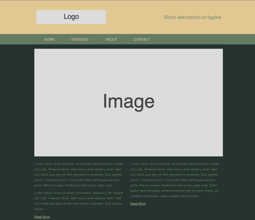
CoffeeCup Studio::
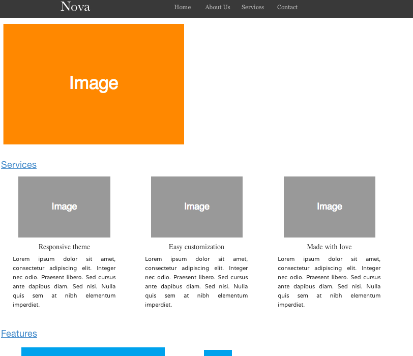
Nova:
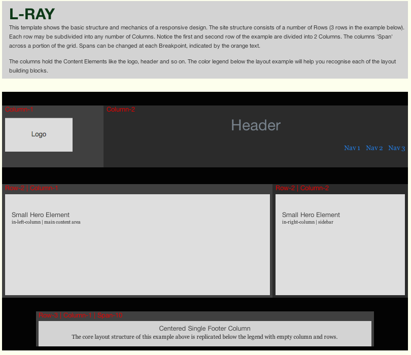
L-Ray:
Layout Maker:

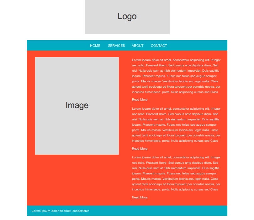
No-Sweat:
Plug:
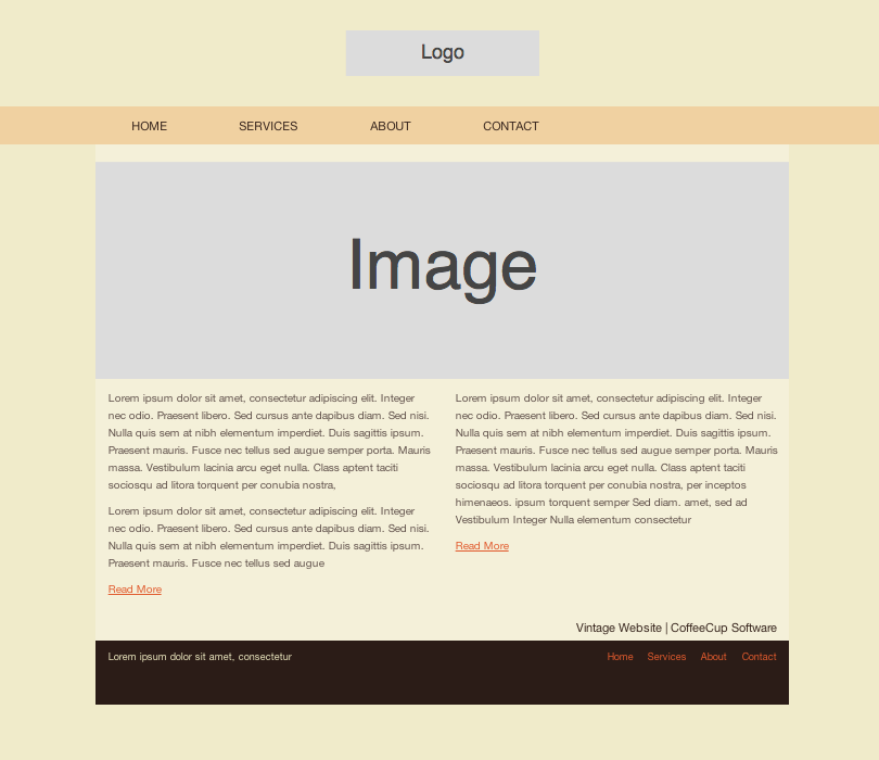
Vintage:
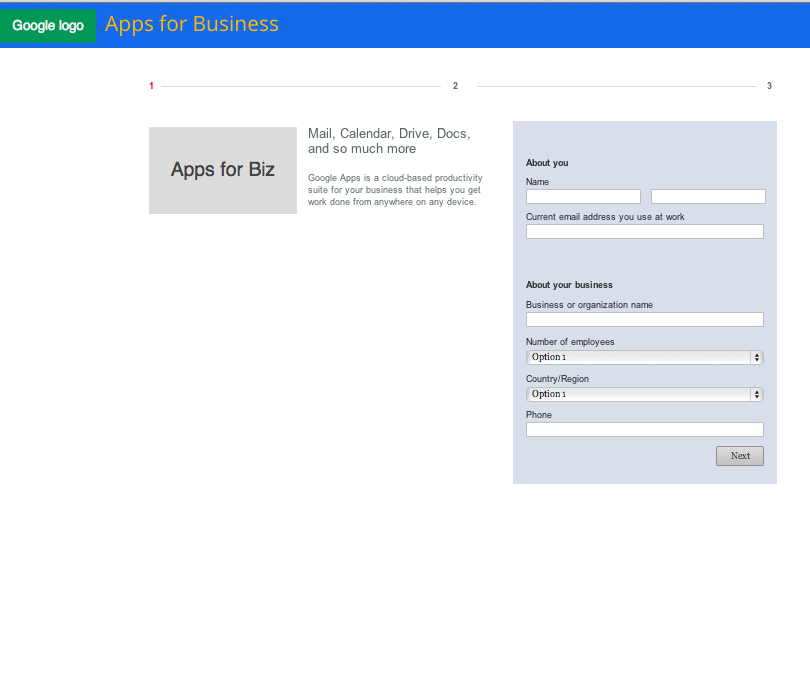
GAB:
Autumn:
Be Happy:
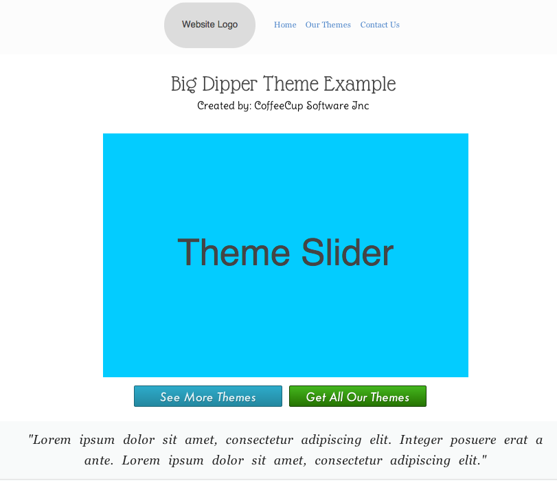
Big Dipper:
Canvas:
Craft:

Elegance:
Please Note!
In order to use these awesome responsive layouts, you must use Responsive Layout Maker Pro for Windows or OS X. These layouts are exclusively only available with the purchase of Layout Maker Pro Template Pack and are not sold separately.