

We know that you were taught that pushing and pulling were unacceptable in school, but that is only if you do it to a living being. It does not count when it is an Element in your design!
What makes Push & Pull so special is what you can do with it! Just take a look.
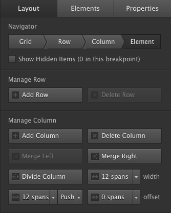
Page elements are displayed in a particular order. By default, they are ordered by their place in the HTML of the page: the 1st element is positioned top-left on the page, the 2nd element immediately below that, and so on. If an element is positioned inside of another element the same principle applies inside that element (the parent element). Elements can be positioned next to each other with the float property. For example, every Column Element in Layout Maker is set to float left. This makes them appear from left to right inside of the parent row in the order in which they are placed.
In a responsive layout design, it can be desirable to make changes to the display order. This can be done with the Push & Pull control. In the example below the green column is placed 1st in the actual code, but displayed on the right on large screens. For mid-sized screens (e.g. tablets) it is displayed in the middle. On smaller screens (e.g. mobile), the orange elements are displayed after (below) the green element.
Most of us will be using Push & Pull for the practical design example where two images are placed next to each other, both with descriptive text below the image. To give the images a bit more display room on mid-sized screens, they can be placed below each other with the associated text on the left or right.
This is illustrated below, both with the orange and green demo elements and a realistic example with image and paragraph (placeholder) elements. There’s a number of other use cases where control over the column position comes in real handy.
If you would like to take a look at the project files to test it out for yourself, you can download them here:
Push & Pull Demo 1 Push & Pull Demo 2Missing some settings?
This is because Responsive Layout Maker Pro was used for the creation of this article. One or more of the settings used here might not be available in Responsive Layout Maker. For the most part however, you can continue through the article adjusting the settings that are available to you.