

Grids Create Order and Consistency.
Consisting of a series of rows and columns, grid based layouts convey order and consistency. They provide an organizational framework that helps to create order in the way information is presented. The order and organization make it easier for the reader or visitor to follow the information and find what they are looking for.
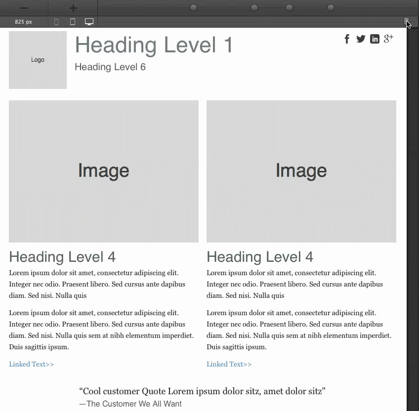
Figure 1: Grids provide organization and visual balance.
Using a grid also helps to create a consistent layout system across pages. Grids have been used with great success in print design for decades. They helped to horizontally and vertically subdivide the content and design areas. Nowadays in web design, people are first and foremost concerned about the columns of the grid, dividing the page width in even vertical sections.
Grid system advantages
Khoi Vinh was one of the first advocates of the use of grid principles in web design. In 2011 he published "Ordering Disorder - Grid Principles for Web Design" (it's an excellent book, you should read it!) in which he lists several benefits for using grids when designing for the web. Benefits include order, continuity, harmony and predictability for the user and improved consistency and collaboration for the designer or design team. He also counters the argument that "grid systems" limit creativity. The below, including the 'breaking the grid' example support his arguments.
Fluid Grids Create Flexible Order and Consistency
A fluid grid system still divides the page up in rows and columns. However, the width of the columns and height of the columns and rows varies with the available horizontal display space, or more correctly 'viewport'. A fluid grid is 'squishable' like a sponge: as the display width shrinks, the columns shrink or 'compress' with it.
Device width, display size, viewport, say what?: The viewport is the visible portion of the content area in the browser. On mobile devices, where the browser window can not be resized, the viewport is almost as large as the screen size of the device. Toolbars and any scrollbars are excluded. On larger desktop screens people nowadays tend to resize the browser window, making the viewport smaller than the size of the display (again excluding browser elements as toolbars). Although viewport is the more correct term, at CoffeeCup we're using the terms viewport, browser window, display width and so on interchangeably. After all, it's pretty clear what the point is, right?
Initially when the width of a fluid grid decreases, the rows grow in height to allow the content to take up more vertical space. This makes it more difficult to maintain a consistent vertical order and rhythm. However, the row based division (rhythm) usually still works pretty good and is always better than no division at all.
Fluid Grids are NOT responsive by nature
A fluid layout or grid is not necessarily responsive. If you keep squishing and squishing the columns become unusable - too narrow to contain content and too tall and different in height to represent an actual grid structure. The main characteristic of a responsive grid is the usage of content columns that ‘span’ a certain number of grid columns depending on the available width. This 'spanning of grid columns' can be seen in figure 2 below.
The number of grid columns a content columns takes up varies with the available display width and is what makes the grid layout responsive. When the width changes, the grid ‘responds’ by updating its content column structure.
The most common approach is to increase the grid span — the column width — when the columns are too small for the content they contain. This can cause some of the content columns on the right to be pushed down, increasing the height of the row. Alternatively the columns are pulled up when the design starts with a focus on small screen sizes first.
The underlying grid structure remains the same, but the visual (content) grid structure seems to change to a smaller (or higher when the width increases) number of columns depending on the display width. This approach creates appropriate amounts of horizontal space for both the remaining, pushed down or pulled up columns. In figure 3 for example a text block is pushed down, creating the right amount of space for each content column.
Grid Columns for Structure, Content Columns for Layout
So at its core, grid columns provide the structure for the content columns. Grids used in responsive web design usually consist of 12 or 24 columns. More columns allow for precise, complex layouts, and give more control over the responsive behavior. Especially when using a granular 16+ column grid, these single grid columns are often too small to hold actual content. They first need to be 'transformed' into containers that are big enough to hold text, images or other page elements.
Content containers are simply cells that 'span' one or more of the grid columns. This can be different for each row and eventually determines the actual layout of the page. These cells will then 'contain' the HTML elements (that structure) the content. That's the reason they are often called content containers and sometimes even 'drop zones'. In Layout Maker for example, they are simply waiting for the content to be dropped onto them, automatically aligning all elements.
This structure is often referred to as a Grid System. The article 'Grid Systems and Frameworks' contains more details and discusses how they work in practice.
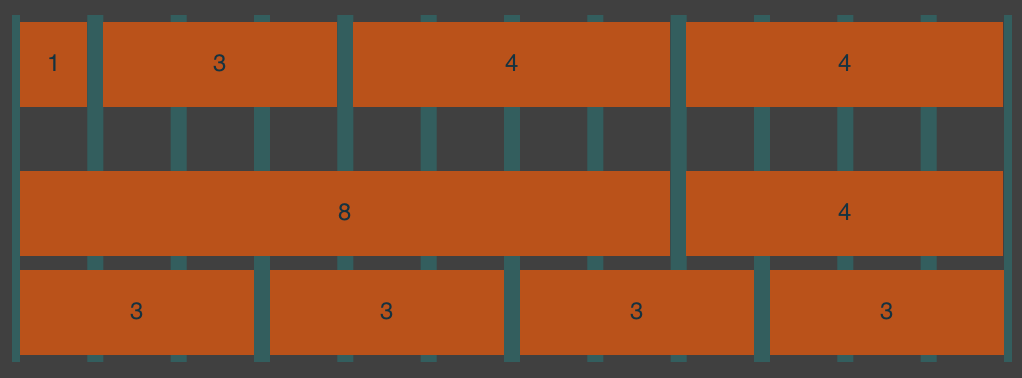
Content columns span one or more grid columns
The first grid row below is divided in 4 content columns. The first content column spans 1 grid column the second spans 3 grid columns, the third and fourth both span 4. Together they take up all 12 grid columns, the full width of the grid. The rows below that show a different layout structure for illustration purposes.
Figure 2: Content columns determine the actual layout.
A Responsive Grid does not have fixed dimensions
The horizontal space the grid takes up - the width - grows and shrinks with the available display space. The grid, and the entire layout made with the grid, are fluid: widths are defined with relative measures - percentages instead of fixed pixel values. The relative widths ensure that the grid keeps it's proportions, all columns grow or shrink to the same degree. However, when the width of a grid decreases, the height increases.
There are two main reasons for the height change to happen. Text in HTML by default wraps to the next line when it runs out of horizontal space. This makes the columns (and entire layout) taller.
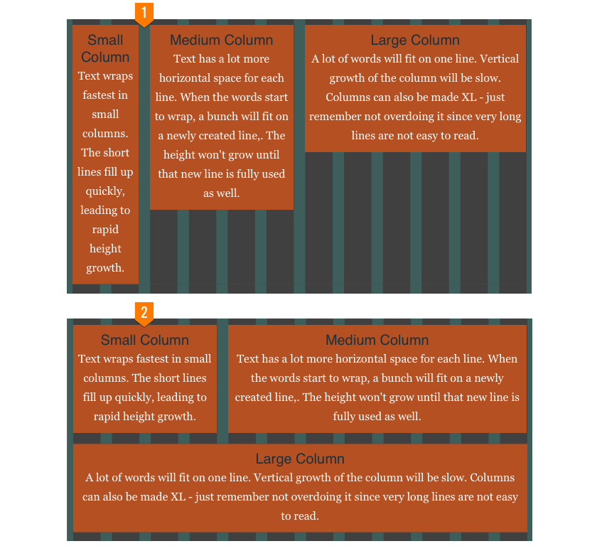
However, this only works to a certain extent. At some point the content columns simply become too small to be presentable. Therefore, in addition to being fluid, in a responsive grid changes are made to the relative widths the columns take up. Frequently content blocks are being placed below each other instead of next to each other, also causing the grid to grow in height. As illustrated in figure 3 this height growth is often less then simply letting the text wrap, and a lot better looking as well!
Under number 2 in the figure below each column has more horizontal space to display it's contents, making the content more easily accessible (viewable). See here the power and awesomeness of the responsive grid, a design method that is far superior over altenatives like zooming out (making the content really small), cutting part of the page off or creating duplicate content.
Figure 3: Stack content columns before they become unusable.
A fluid grid does not extend indefinitely (although it could).
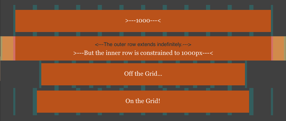
Usually a width is defined at which the grid stops extending, the max-width. The widely supported max-width CSS property prevents an element (the grid in this case) to become larger than the specified size. This will make the layout look good on bigger displays like for example television screens. The maximum width of the grid used in the example infigure 4 below was 1000px in the Layout Maker App (but the screenshot is scaled down).
Some rows don't follow the grid's max-width rule.
Designers like to push boundries and break rules. It's only logical that as soon as the grid provided order, they started to break it. And we all love them for that :) Yep, breaking the grid can communicate meaning and set things apart.
A row that keeps stretching as the page becomes wider is often used for headers or footers, denoting the start and end of a page. Frequently this is also used to separate different sections of a page. Oh, and rows can be made shorter for similar reasons as well...
In the example below the outer row (the second row) extends indefinitely. But the insides of the row (the content) is still constrained to the same maximum width. This can be done by using a sub grid or container element. The content container uses the darker orange background and is as wide as the first row.
A smaller section adds variety. The sudden width change can be used to draw attention to a section or item. The container size is 'locked' until the display width becomes smaller than the container width. The maximum width of the third row in the example was set to 800px. However, using max-widths can take these sections 'off the grid' as illustrated by the non-matching grid pattern.
Figure 4: Playing with widths.
Sub (nested) grids for granular layout control
Not a lot has been written about the use of sub grids in responsive design. Yet, everybody that has been making responsive layouts or been working with frameworks like Bootstrap and Foundation know that they can come in very handy at times and be an absolute necessity at others. Sub grids provide the same type of organization within a single content column as the overall grid provides within a page. The column is sub divided in sub rows and sub content columns that can span one or more sub grid columns. Frequently the sub grid uses the same grid configuration - the same number of columns and gutter - as the master grid. This supports the continued feeling of order and consistency.
The left and right content columns in the row below each span three (3) columns of the master grid. Each column contains a sub grid with two rows. The first sub grid row of the left column is divided in three content columns. The content column spans six (6) out of the twelve columns. The second and third each span three (3) columns of the sub grid. The second row contains two content columns that span nine (9) and three (3) grid columns respectively. So, in the example below the first number in each container denotes the span number of the master column, three (3) for both the left and the right columns, and the second number the span of the sub grid.
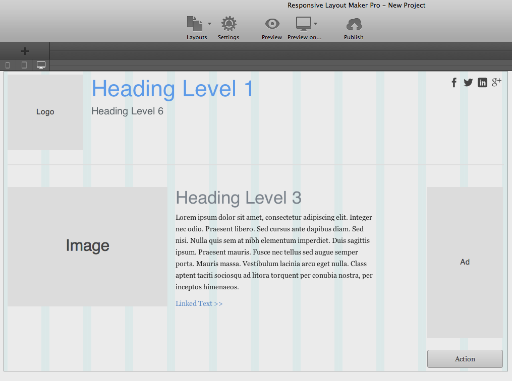
Figure 5: Full control over custom responsive actions — Powered by Responsive Layout Maker.
The real layout design is high-res of course. You can view it here — just resize your browser to check that this layout looks good at every possible display width.