

Just a note before we get started: There are many different ways you can perform the functions we’ll explain in this tutorial. For example, to save your form—which you should often be doing.
You Can:
- Go to File > Save
- Click the Save button on the Toolbar
- Press Ctrl+S
Also, know that you can get a jump on a specific type of form by choosing File > New from Template.
You can choose from a ton of often-used form types and tweak them to your needs. All right, let’s get started!
Step 1: Adding a Title
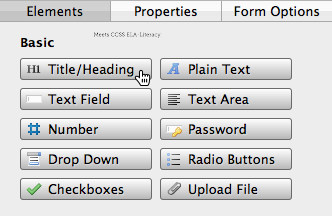
Let’s begin by providing a descriptive title. Click the Title/Heading button in the Elements pane.
Notice that a title has been added to the top of the form, but it’s just text reading “Title”. To change this, select the title and click the Properties pane. Let’s change the text to “Contact Us!” and the font size to 18. You can also simply double-click the title element to access the Properties pane.
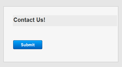
Hey look, a title! Let’s add some more stuff!
Step 2: Adding a Text Field
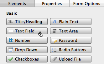
Since this is a contact form, let’s create a text field where our user can type their name. Click the Text Field button under the Elements pane.
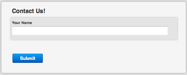
This adds a new text field to our workspace with the word “Label” above it. To change this, double-click the element or select it and switch to the Properties pane. For our example, we’re putting the words “Your Name” in the Label field. Notice that the form updates in real time as you type.
While still in the Properties pane, look below Label at the field called Name. While a Label is what is shown on the form, Name is used solely for internal purposes; the form submitter never sees this value.
Web Form Builder provides a default Name value such as “text2”, and if you don’t change it, your form results will arrive with the person’s name shown next to “text2”. It’s a good idea to change this to something that makes more sense, like “Name_of_User”.
Great! Now we need to add another input box to collect the user’s email address. There is a specific button for this purpose that does things a little differently than a standard input box.
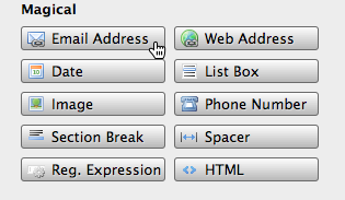
Step 3: Adding an Email Address Input Box
To include a field that specifically collects an email address, click the button marked Email Address in the Magical section of the Elements pane. Let’s see how that looks.
This button does things a little differently than a standard input box: It includes the default placeholder text “you@domain.com” which helps guide the user. It places an example of an email address in the input box which disappears when a user clicks it. Enter appropriate Label and Name values like you did before, and enter new Placeholder text if desired.
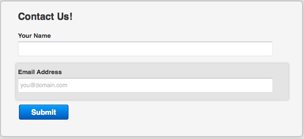
One more thing: See that checkbox labeled Verify in the Properties pane? Checking this box includes a second email address input which requires users to match what they entered into the first one. This option can be valuable if your users need to be extra careful to give the correct email address.
Step 4: Adding Radio Buttons
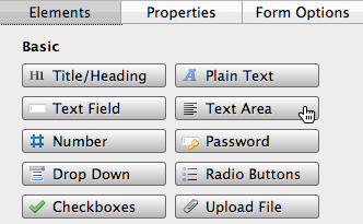
Next, let’s add some radio buttons to our form. To do this, click Radio Buttons under the Elements pane.
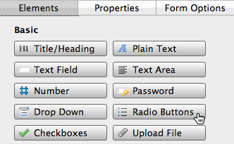
By default, this will bring up three radio buttons to your form, with the label “Select an option”. Let’s go ahead and change this value under the Properties pane to “Why are you contacting us?”.
To change the labels of the radio buttons, double-click each item in the Options box to enter new text. To add, delete, or rearrange the order of the radio buttons, use the plus, minus, and up/down arrows underneath this box. Let’s add a fourth radio button using the + button. Use the drop-down menu marked Layout to choose how the buttons are arranged in the form.
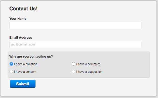
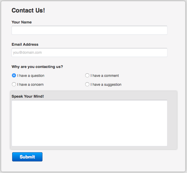
Next, let’s give our users some options. Select one of the radio buttons and change the label to “I have a question”, and the others to “I have a comment”, “I have a concern”, and “I have a suggestion”. Because these labels are somewhat long, change the Layout value to Two Columns.
Let’s check out our form now:
Step 5: Adding a Text Area
Let’s give our users a space to write more comments. In this step, we’ll add a text area where users can enter a large block of text. First, click the Text Area button under the Elements pane.
Let’s work with some of the text area settings under the Properties pane. First, we’ll add this name to the text area: “Speak your mind!”. You can change the size of the text area by adjusting the values in the Width and Height boxes.
And here’s how our form looks:
Great! But those radio buttons may not be the best choice for this form. Let’s see what it looks like with a drop-down menu instead.
Step 6: Adding a Drop-Down Menu
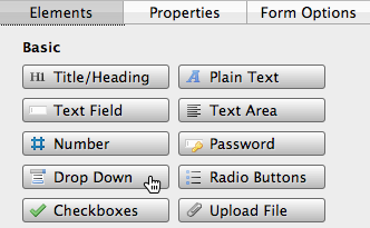
To add a drop-down menu to your form, click the Drop-Down button under the Elements pane.
Select the drop-down menu and switch to the Properties pane to give our drop-down menu a name—how about “Contact reason”? Next, let’s add an option with the + button, and then change the options to “I have a question”, “I have a comment”, “I have a concern”, and “I have a suggestion”. Since we now have this drop-down menu, we don’t need those radio buttons anymore. Select the radio button section of your form and click the Delete button on the right under either the Elements or Properties pane. Now drag your drop-down menu up into the space between “Email Address” and “Speak Your Mind!”
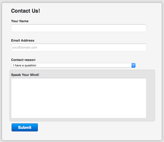
That looks pretty good—plus, we freed up a lot of space. Now let’s do a little bit of final touch-up!
Step 7: Setting the Form Options
Now let’s switch over to the tab called Form Options where we’ll adjust settings to the entire form.
Here you can choose a font to be used in the main text of your form, as well as the color of the font and the text size. You can also choose how the labels are oriented compared to their corresponding elements with the Label Position drop-down menu. Set the width of your form with the Form Width field.
If you’d like to ensure that your form is being used by a human and not a bot programmed to fill out forms, select an option from the Captcha drop-down menu. Captcha requires that the user identify two words designed to be illegible to bots, stopping them from automatically filling out your form.
Step 8: Applying a Theme
With just two clicks, we can give our form a complete makeover! First, click the Themes toolbar button.
This button opens the Theme Browser.
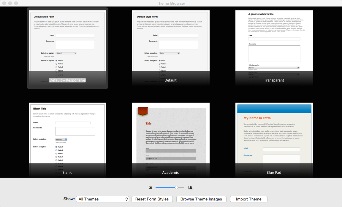
All of the Form Builder themes on your computer appear in the Theme Browser. Notice as you click through these options that the theme is applied immediately. This allows you to try a ton of designs quickly to find the one that works best. For our example, we’re going to choose the “Academic” theme.
Our form is completely done! Ready to see what it looks like in a browser?
Step 9: Previewing Your Form
You can use the Preview tool to see how the form will look on the web! To do this, click the Preview toolbar button. Because previewed forms display fully-functionally, we can test the drop-down menu.
Choose one of the browsers installed on your computer from the list to open a preview of your form. You can now preview all of your form elements. Here’s how our form looks:
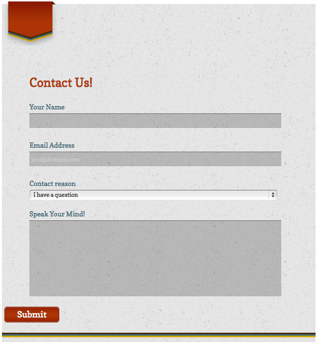
Nice! Notice that we’ve been using a form width of 370 (adjustable in the Form Options pane) and that we’ve left-aligned the Submit button. You can select the Submit button and adjust its properties just like any other element. Okay, let’s upload our form!
Step 10: Putting it Online
The easiest way to get your form online is by entering your CoffeeCup account information in the Form Publishing tab of the Settings menu. Trust us, it literally takes seconds to set up and makes publishing a one-click process. For real!
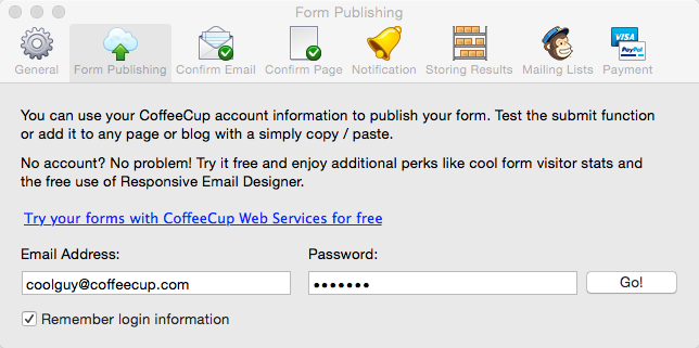
Click “Get an account” if you don’t have a CoffeeCup account yet. It costs nothing, and it automatically sets up your free testing S-Drive account.
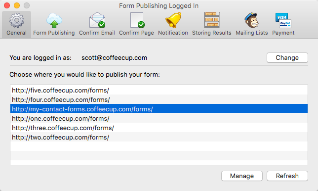
Once you click Go! you’ll just need to choose an address to publish to:
Now that your publishing destination is set up, your form can join its HTML pals on the Internet. Feel free to click the Publish toolbar icon at any time.
You’ll probably be prompted to save the form first, which is always a good idea. Click Publish as many times as you want; Web Form Builder will overwrite all the necessary files, so you don’t end up with hundreds of redundant files.
The last part of the publishing process is the Form Successfully Published! window:
You can click the link shown here to test the form in the real world—right on the web! It’s not just a good preview; it’s the real deal.
And that’s it! You’ve successfully designed and uploaded a basic contact form. Without setting up anything else, form results will start collecting in your S-Drive Dashboard. You’ll be able to read and manage those results in a slick interface.
Of course, this is only the beginning of what you can do with Web Form Builder. There're lots more options for how your form handles results and submissions that can be configured in the Settings menu. You can read more about these options in the Setting Up Form Result, Notification, and Confirmation Options chapter.
There are other options for uploading as well. You can read about them in the What to Do with a Finished Form chapter.