

Modifying a framework less Reveal Component.
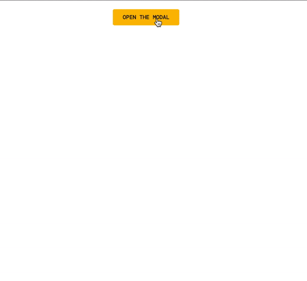
CoffeeCup Components are 100% customizable. This way you can tweak the already made features without having to build them from scratch. The reveal component is one of the most popular items. It is a collection of elements that work together to make content appear on screen when the action button is triggered. Site Designer offers this prebuilt component and makes it easy for you to modify it with your own content. In this tutorial we will show you exactly how to tweak the styles and modify the component with additional content. Download the Reveal Modal for Frameworkless projects.
Import Component
Starting with a Frameworkless CSS project, load in Reveal Modal component from the Component Library.
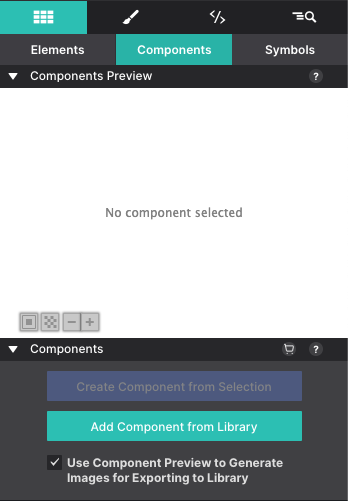
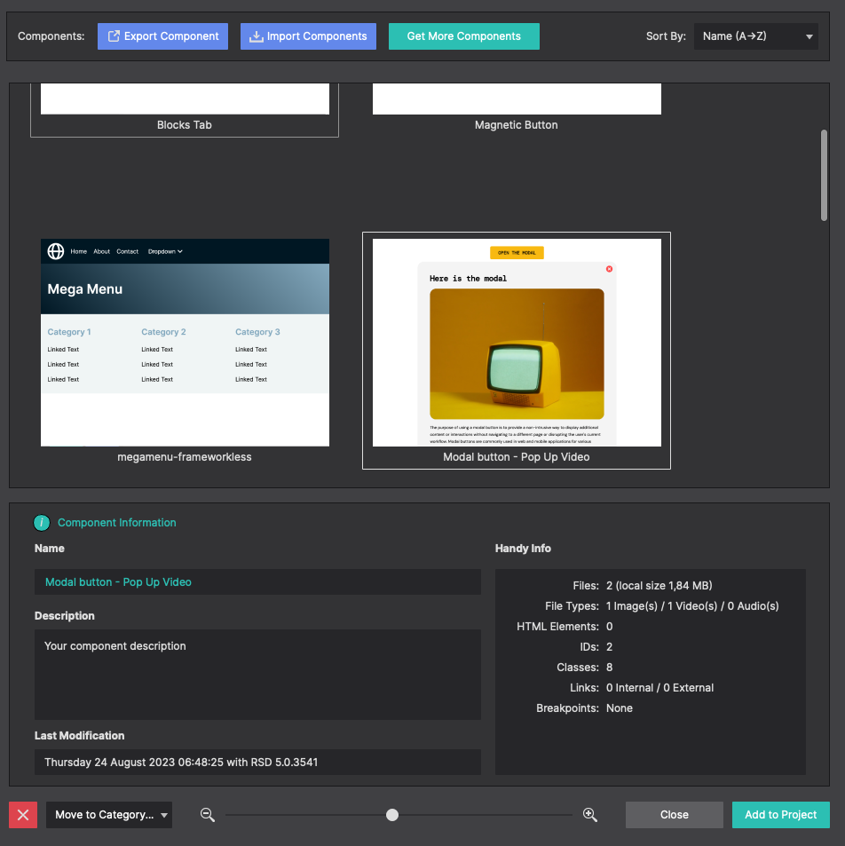
At the top of the dialog box, click on Import Component to select the file from your computer. If the component is already installed, you'll be able to select it from the list on the side. Click Add to Project to associate the component with your project.
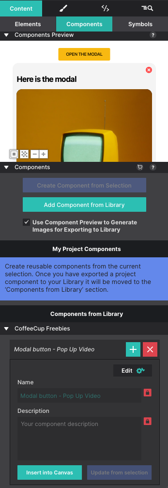
Once imported into your project the component will be available on the Content pane > Components section. Click the + or Insert Into Canvas to inject it into the page.
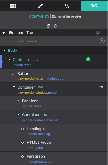
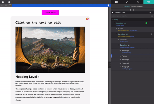
View component structure on the Inspector pane.
Using the Inspector pane you can view the entire structure of component. The component is wrapped in a Container DIV element with the class name ‘modal-wrap’. This parent element contains the necessary elements to make the image reveal upon click.
Hover over the elements and they will highlight on the screen. Double clicking on the element from the Inspector pane will launch the Styles pane where you can edit and tweak the styles. Let’s try changing the color of the reveal button.
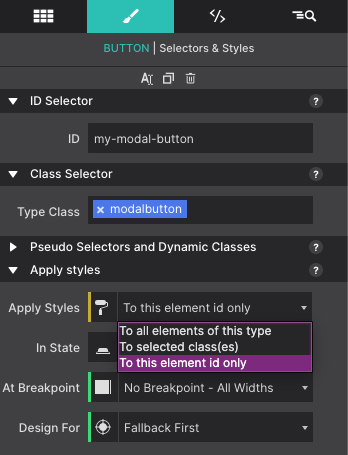
Start by selecting the Button element with the class name ‘modalbutton’. You’ll notice the element has a yellow ID class name “my-modal-button”. This means there are styles applied to the CSS ID selector.
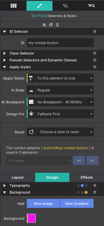
From the Styles pane, with the button selected, use the Apply Styles drop down to select “to the element ID only”. This allows you to change the styles for this individual elements styles without affecting other similar elements.
With the Class ID now selected, scroll down to the Design > Background section. You’ll see the Yellow square next to Background. Click the box to choose a new color for the reveal button.
Using Class Names
Class names are an important part of the design and it is good to get in the habit of naming your items as soon as you add them to your page. Class names allow you to style common items all at once. For example, all headings with the same name, all menu links, any button within the project that share the same name would all share the same styles (color, size, font type etc.) This saves you from having to apply the same styles every time. Everything stays in sync by using Class Names. This also makes it easy for you as the developer to identify items within your project quickly.
Learn more about CSS Selectors here.
Edit Component Styles
To change the text on the button, simply double click on the canvas. From the Styles pane > Design > Typography section you can modify the font style, size, color, and more.
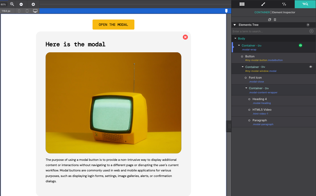
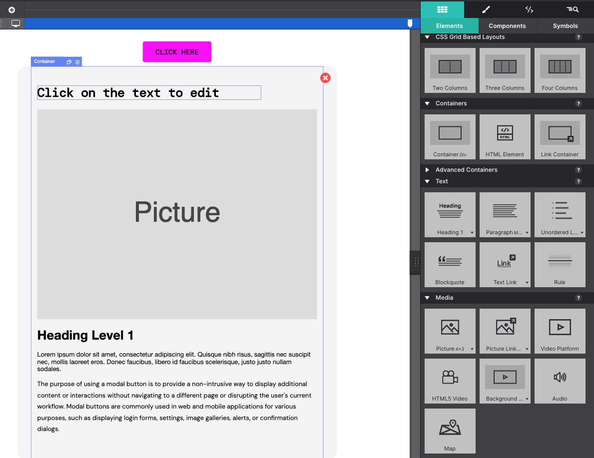
Now let’s learn how to modify the content that is revealed when clicking the button. In this case it is the TV video with a Heading and paragraph text.
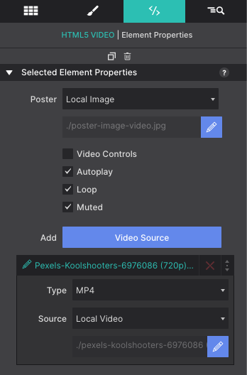
Swap out the video with one of your own from the Element pane. A new static image poster and video file can be replaced by clicking on the pencil icon.
Rather have different content? An image instead of video? Additional paragraphs? An action button? Easy-peasy! From the Content pane, drag and drop elements into the component parent Container. The component is already configured to reveal everything in the box so you may add whatever you like to display.
If you would like to see what the component looks like when not activated, go to the Inspector pane, and click on the eye symbol next to the ‘my-modal-window’ Container. This will toggle the content in and out of view so you can see what the item will look like when it is and isn't triggered.
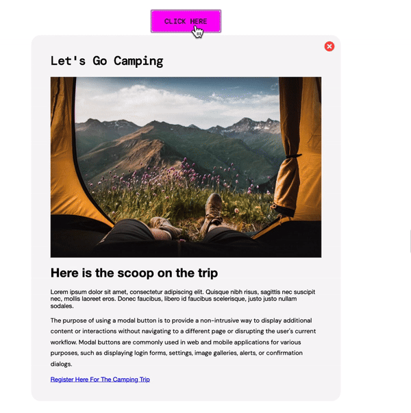
After your changes are completed, you can preview your work in the app or test it in your browser.
Learn More About Customizable Components.
Don't waste time and effort reinventing the wheel. Our fully customizable components are designed to simplify your web development process. By simply importing our components into your project, you can easily tweak them to fit your content and message, allowing you to achieve a professional design in minutes.