

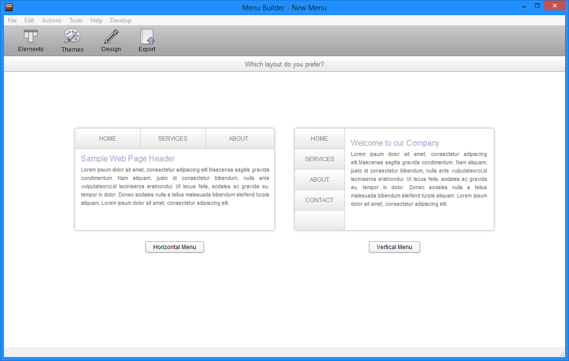
When you start Menu Builder for the first time, you will have to choose the type of layout you would like your menu to use. Once you select a layout, it cannot be modified later.... or can it???
With responsive design, using breakpoints allows you to change the way your menu appears based on the device your visitors are using. To accomplish that, you will just need to set a breakpoint and adjust certain settings to switch from a horiztonal based menu to a vertical based menu.
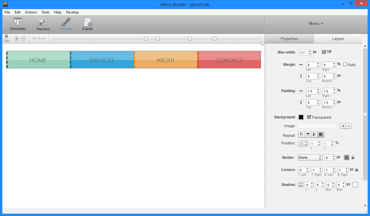
Step 1:
First you need to build your menu! :) This article will not get into the finer points of menu design fully as it has already been done in our Menu Builder Quick Start Guide . You can also use download example Canvas Menu project site to follow along with the screenshots below.
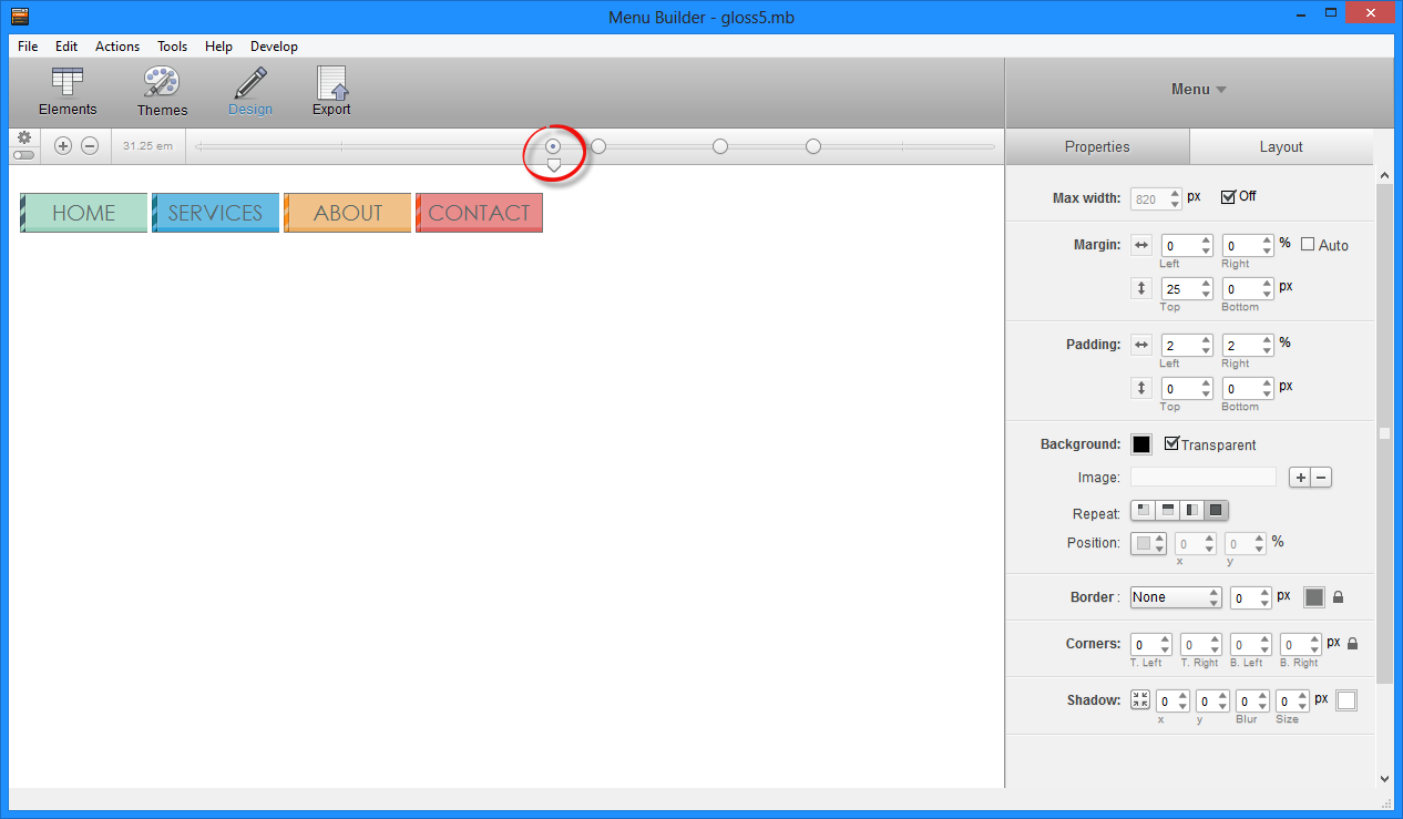
Step 2:
Select where you would like your menu to become vertical (visually) by moving slider to left. Most will choose around 480px and create a break point there by clicking the + sign on the left..
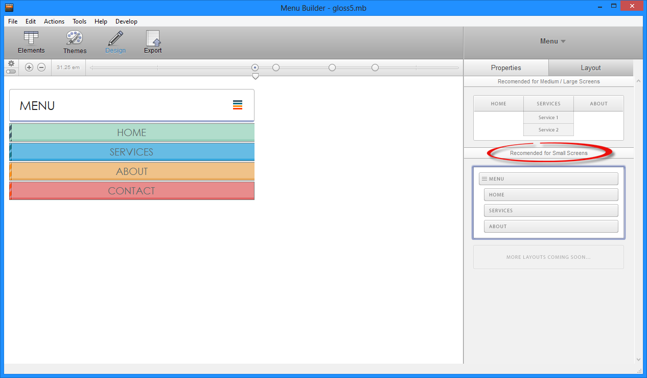
Step 3:
Select the break point and go to the Menu click the Layout Tab.
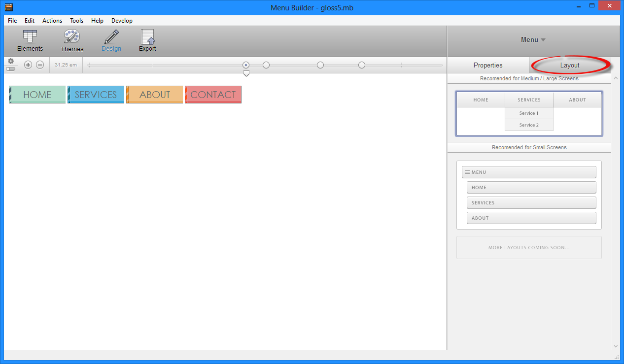
Step 4:
Select Recommended for Smaller Screens and you are done!
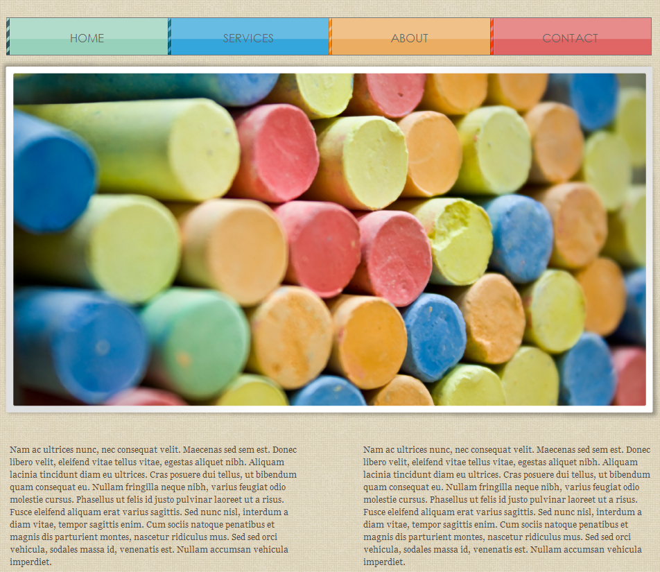
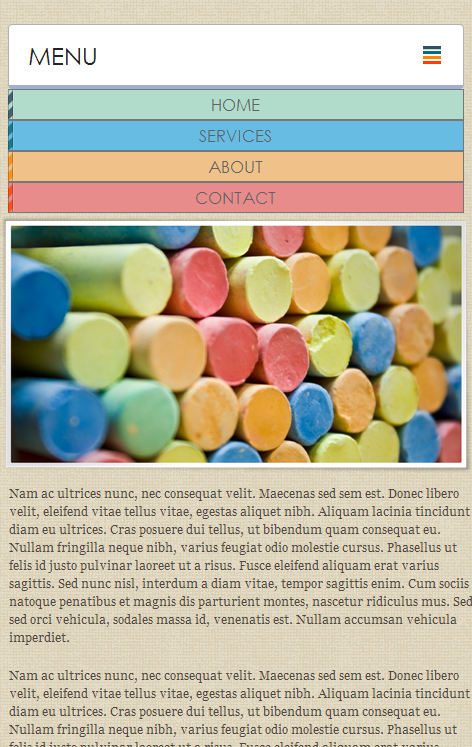
Now you just need to Export your menu and you are ready to go! Take a look at what the website will look like.
Full Size:
Mobile View: