Design Conditionally for Outlook With RED
Building great looking campaigns that work on Outlook has always been a challenge. While being one of the most popular email clients on the market, it lacks support for many awesome style controls. For example, Outlook turns images off by default for most readers and it also has trouble display background images. Other annoying quirks include how it ignores media queries and font fallbacks. So if you’re using a fun Google font with a web safe font, Outlook will just default to Times New Roman (yawn!) instead of displaying the fallback option.
This is demonstrated below. The email on the left looks great in email clients like Gmail and Yahoo. While the version on the right is how Outlook renders the same code. As you can see, background images and row spacing are lost, along with text formatting.


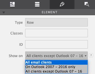
The solution is to design conditionally for Outlook using the Show On control. With this dropdown you’ll have the ability to show an element on All Email Clients, display on Outlook 2007-2016 only, or render across all clients except Outlook 2007-2016. Set this control for any element or layout feature of your design. By default, this control is set to show content on all email clients.

Below is a real use case example of how you would use this tool. It is something we use commonly with our own newsletters so that we can control how the design will appear for the problematic Outlook clients.
Using the 'Show On' control
1. Craft s stylish header for email clients other than Outlook
This email design features a full-width row with a spacious height of 500px. Within that row is a background image with a Heading 1 element placed on top of it. We’re using our signature Roboto Google Font for the heading with a fallback of Arial for any clients that may not support Roboto.

Outlook clients however will end up butchering this design. Since we know they will drop the background image and ignore our fallback font what we’ll do is select this row and set the Show On control to display on All clients except Outlook 07-16.
2. Build an Outlook only version
Next, add a constrained row to the design. The row doesn’t need to have so much height as we’re not going to apply a background image. Instead, leave the height set to zero and allow it to expand as necessary by the content that is added to it. Insert a new heading into the row this time using a Web Safe Font, Arial. This will be something Outlook will be able to read and render right off the bat.

Drop in an Image element (psstt...dimension type don’t matter as we can adjust that in the Design) under the heading to apply a variation of the top header graphic. This way if any Outlookers have their images turned on they’ll still get to enjoy the nice picture.
With the design of the row complete, the last thing to do is set the Show On control to display On Outlook 2007-2016 only.

That’s it! You now have two versions of the email header. One that will be served to Outlook clients and another one for everyone else. This trick will work for anything in Responsive Email Designer. Giving you the flexibility to use design features that are supported by most email clients while still providing a consistent design for Outlook.
Use the Inspector pane to toggle the hidden items into view.
The 4th tab on the right is the Inspector pane. Here you’ll find a tree of all the elements within your design. To show a hidden element such as an Outlook only row — so that it can be styled — just click on the little side icon. Mousing over an element highlights the element on the canvas. Double click it to launch the item’s style properties.


