

One of the most important parts of a website is the navigation menu. The navigation menu is like the roadmap the user must follow in order to reach their destination. Make the journey any lengthier than necessary, and chances are the user will get tired and bounce. With good reason, it’s a no brainer that people like everything fast. Therefore, a good navigation must be organized and concise for optimal user experience.
You can create your own component from scratch. For those who have several links but don’t want to crowd up the navigation bar, you’re in luck. In this tutorial we will go over how to create nested menus, so that your website can look stylish and better organized!
Before we get started...
In this tutorial, we will be using the Foundation framework and its attributes to create responsive nested dropdowns. It is highly recommended that you have the documentation close at hand. Otherwise, it is more likely to get confusing! If there are more attributes you wish to add, use the doc so that you can learn about the attribute, follow along with the code and apply it to RSD. Good luck!
Watch the Video Tutorial
Create Your Navigation Bar
Begin with your slider to the left of the first breakpoint. Drag and drop a Container to your canvas (for the sake of semantics, use a Container Nav). Give it a Class name nav-region
Add another Container element. Give it a class name nav-bar then add a Text Link and a Font Icon Link. These can be found under the drop-down selector for Font Icon. The elements should at first appear stacked.
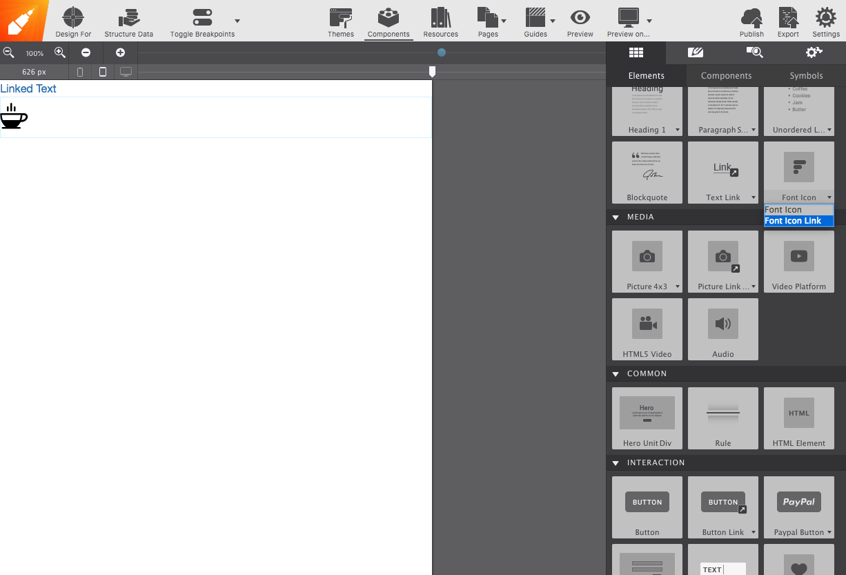
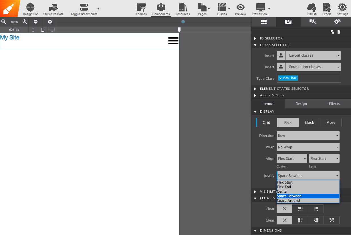
To modify this current layout and place them inline, select the container and go to the Styles pane, go to the Layout section and change the Display to Flex. To have both elements at opposite ends, under Justify select Space Between. Now it’s starting to take better shape. Let’s modify the text link to make it more appealing. Give the text link a class name and add your styles. I increased the font size to 20px and under Flexbox, changed the alignment to Center. But you can style them however you want, more power to you!
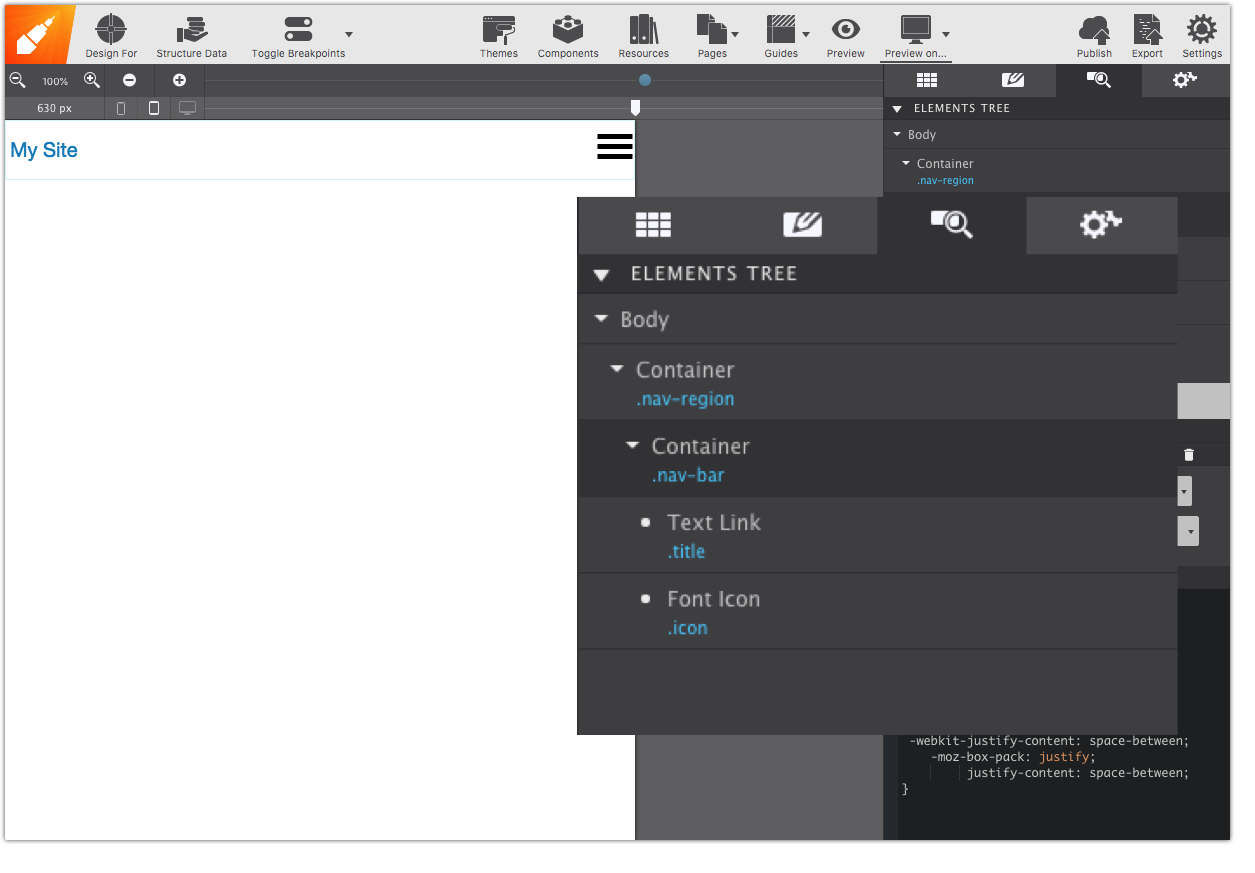
We’re done with the navigation bar (for now). Your structure should match the element tree below.
Next up is when the fun part begins. Time to add some menu links!
Add Your Links 
First select the nav-region container, then from the Content pane, drop a second Container. This will allow us to manipulate its contents without affecting the navigation bar. Give it a unique ID name (like sub-nav); we will use it later on. Also, give it a class name
Next, add a List Container into the sub-nav Container, this is the equivalent of the <ul> element in HTML, they have just been placed in their respective container. You can modify how many list (<li>) elements you want by going to the Element pane.
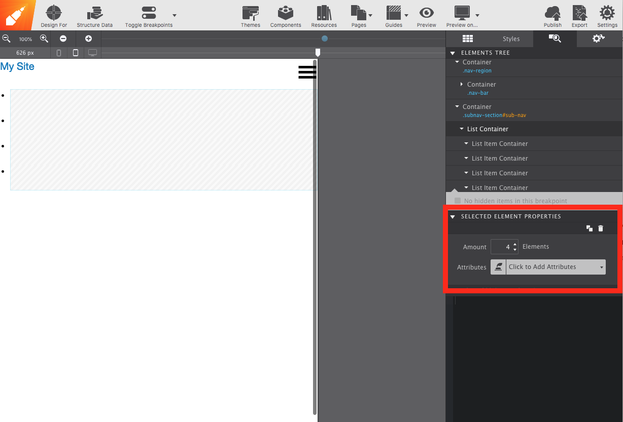
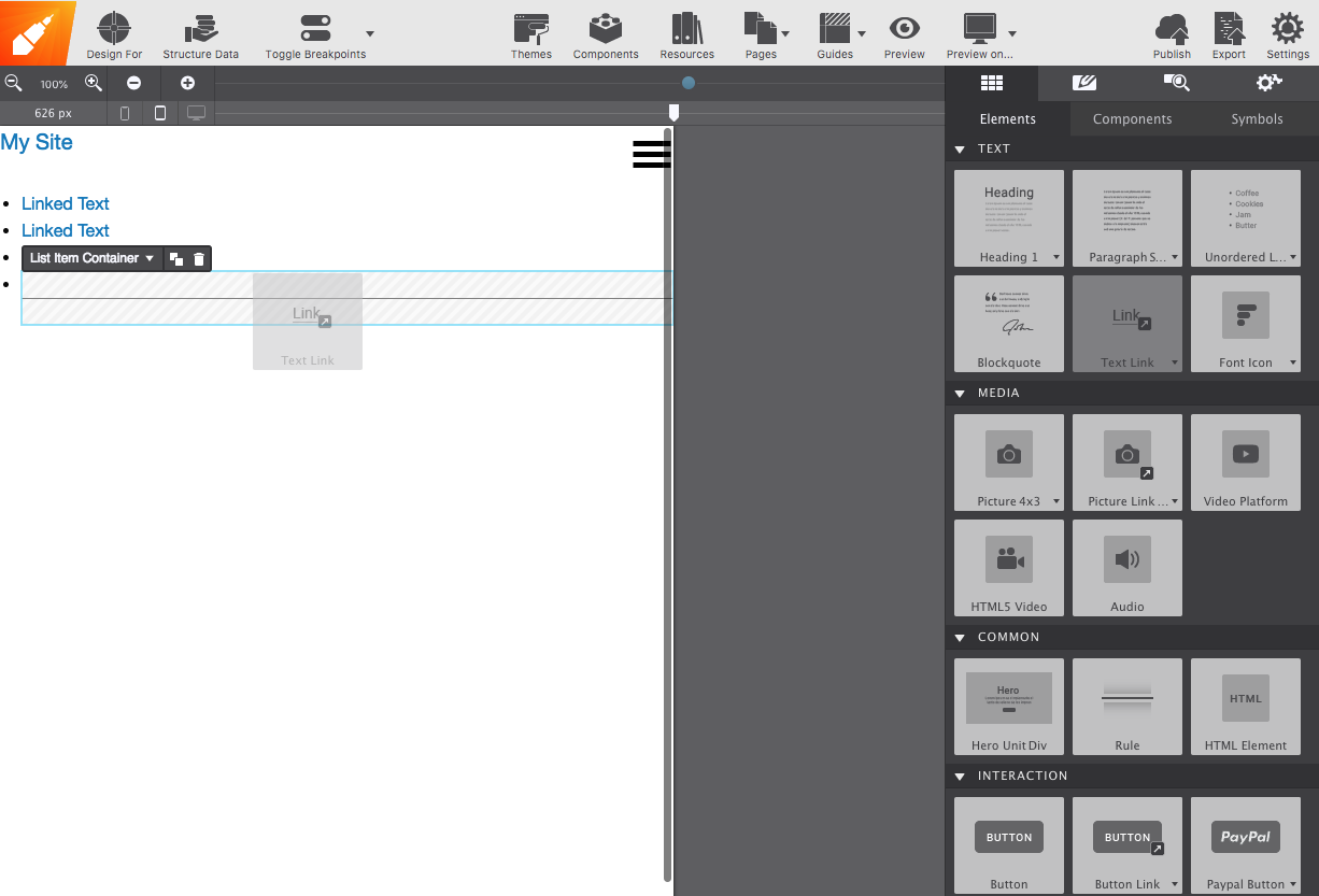
To add your links, drag and drop a Text Link element into each List Item Container. Click on the canvas the change the text to reflect your link titles (i.e. Home, About, Contact...).
Attribute it Up!
Ultimately what we want is a navigation menu that works well on mobile and desktops. For mobile, an accordion-style menu is usually what works best. For higher resolutions, we can switch that over to a dropdown menu.
What the heck are attributes?
Most websites now use interactive elements to make their pages more interesting and not so...static. Examples like these include clicking on a button and having a menu slide down (which is what we will be doing today!).
In general, attributes are there to give more information about a particular element. Event attributes allow elements to specify a script to be run during a specific event (i.e., during a ‘click’).
Many of these scripts require communication with Javascript, something that can’t usually be done with the app itself. Fortunately, Foundation, Bootstrap, and Materialize have incorporated their own respective Javascript attributes into their frameworks. The list of these can be found in Site Designer’s Attributes section on the Element pane. For more details on the kind of power each attribute holds, check out each framework’s documentation.
From here on, for better practice, we will begin following the code provided for us in Foundation’s docs.
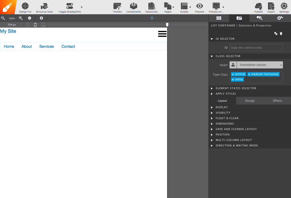
Locate the List Container. An easier way to do this is by going on the Element pane and selecting it from there. Mouse over the element name to see it highlighted in the live preview. From there, you can see you have the <ul> element selected. Good! According to the code, that is the one we should start with!
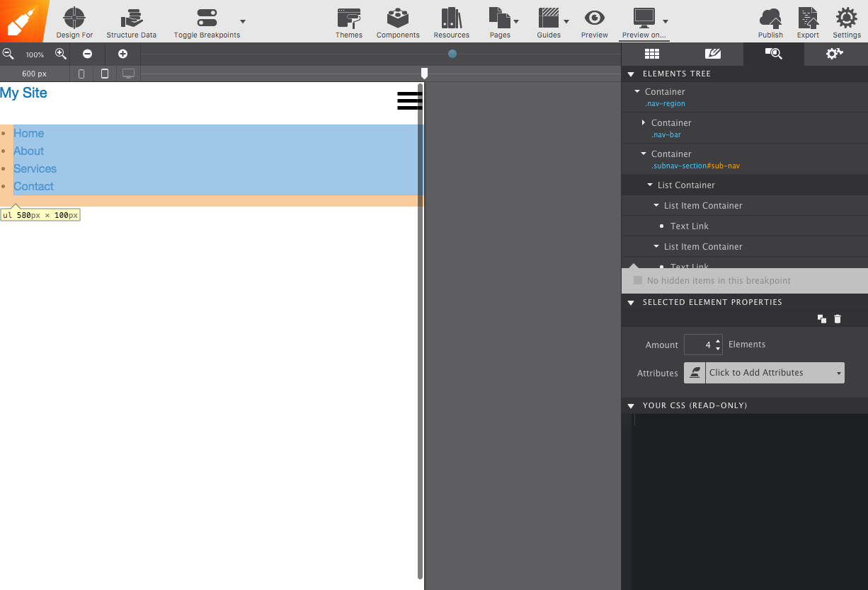
Double click on the element to open up the Styles pane. Give it the vertical medium-horizontal and menu classes. The vertical class will align the menu vertically, beginning on the smallest screen. The medium-horizontal class changes the orientation to horizontal once it reaches a medium size, or breakpoint. The menu class is there to turn it into a flexible component for navigation.
After applying the classes, drag your slider to the right and see how your menu changes!
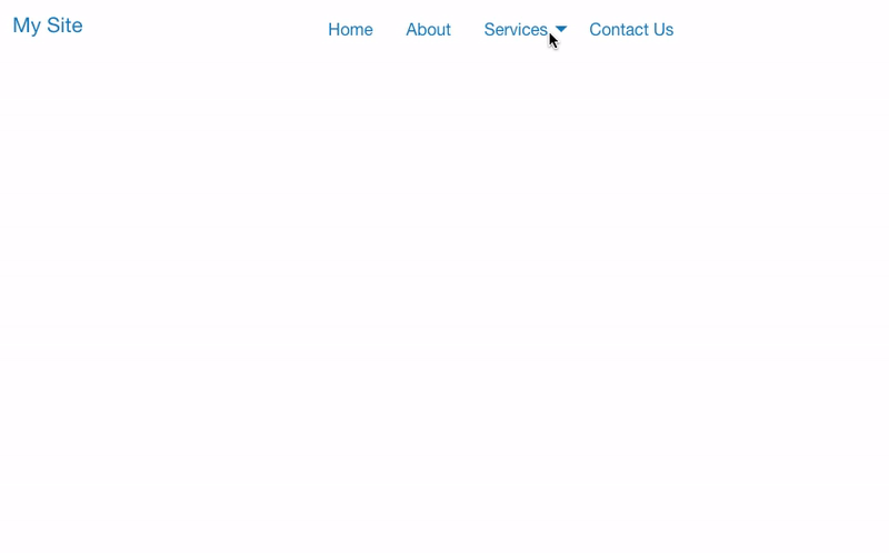
It’s time to add a dash of fun to our navigation! Under Elements pane go to Attributes, select Data Responsive Menu, and add the value accordion medium-dropdown. As a default, we would have an accordion menu. From medium screens and up, our menus would turn into a dropdown.
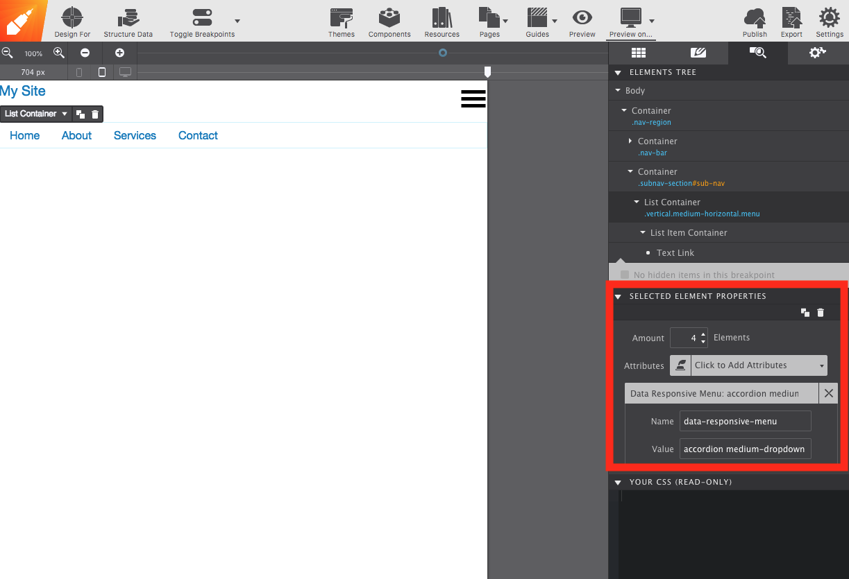
With this, we have translated the first line of code into Site Designer! Let’s keep going!
Toggle
We’re not done with attributes yet. We still need to make it so that clicking on our hamburger icon triggers the script to allow the menu to appear, along with making the navigation bar disappear entirely on larger screens.
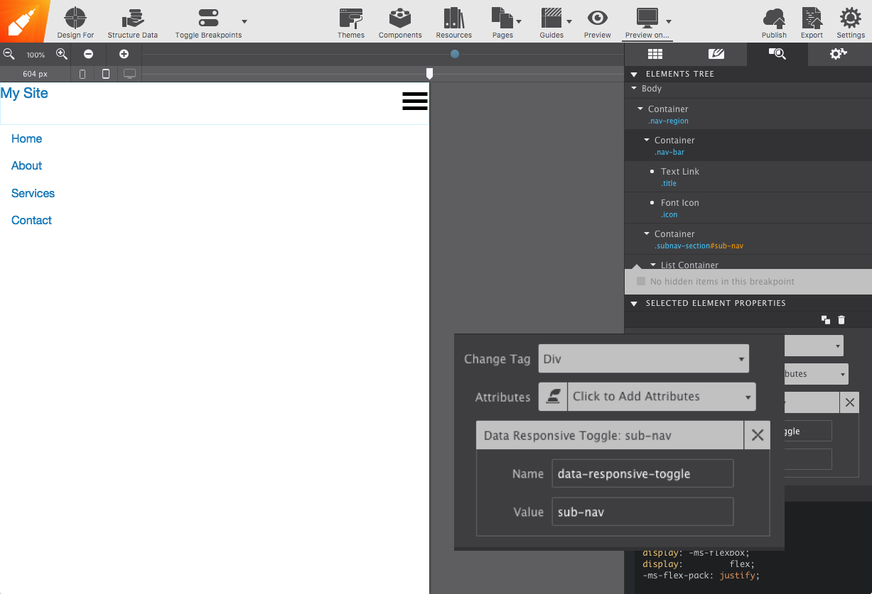
To make this happen, select the nav-bar Container and add the Data Responsive Toggle attribute.
Afterward, select your menu icon and give it the Data Toggle attribute. IMPORTANT: For both of the attributes, make the value equal to the ID you gave the second container. In this example, we used the ID sub-nav. To witness this transformation, preview it within your browser using the Preview On... icon. So cool!
We’re almost done! How about adding some nested links?
Nested Menu
Organization is important for optimal user experience. In order to prevent the user from clicking on a link and searching the entire page for the subject they want, you can categorize it under its appropriate link. In this example, we want to put a bit more info under ‘Services’.
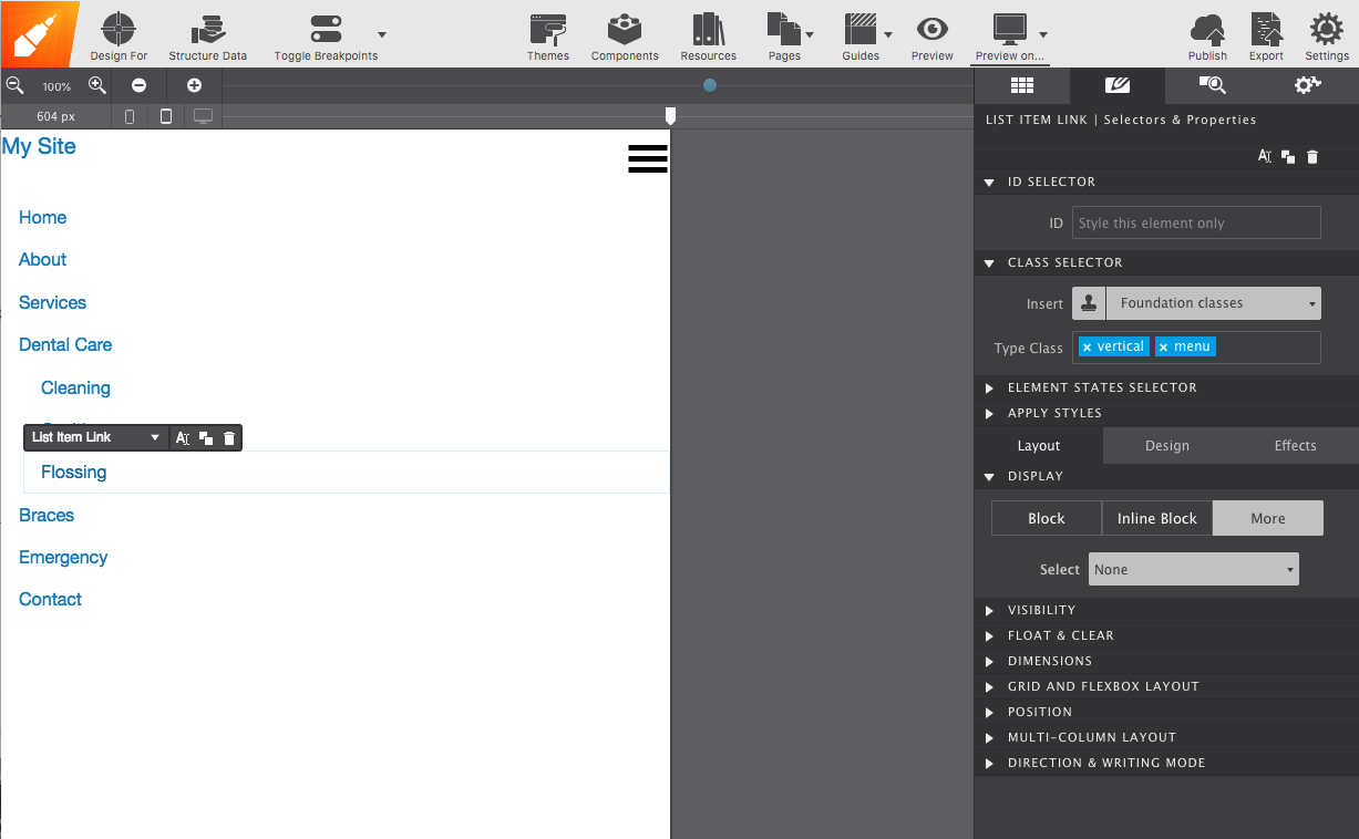
Select the link’s parent which is the List Item Container. From the Content pane, drag and drop a List Container.
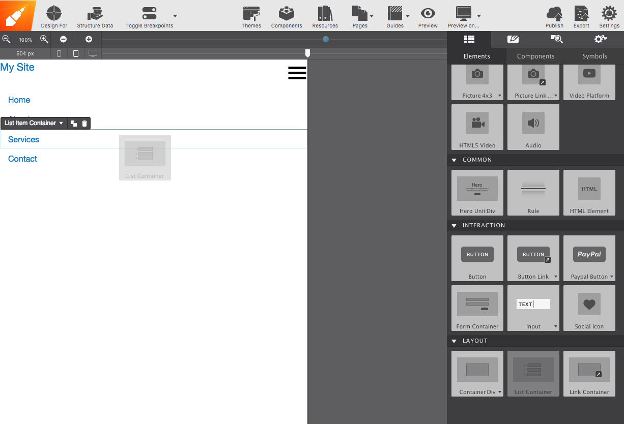
On the Element pane you can adjust however many in the list you need. Then add a Text Link element into each List Item Container just like we did previously. Remember, you can make sure it’s in the correct order by opening the Element Pane. I put the nested-menu class on only for the screenshot below to help you identify the nested menu.
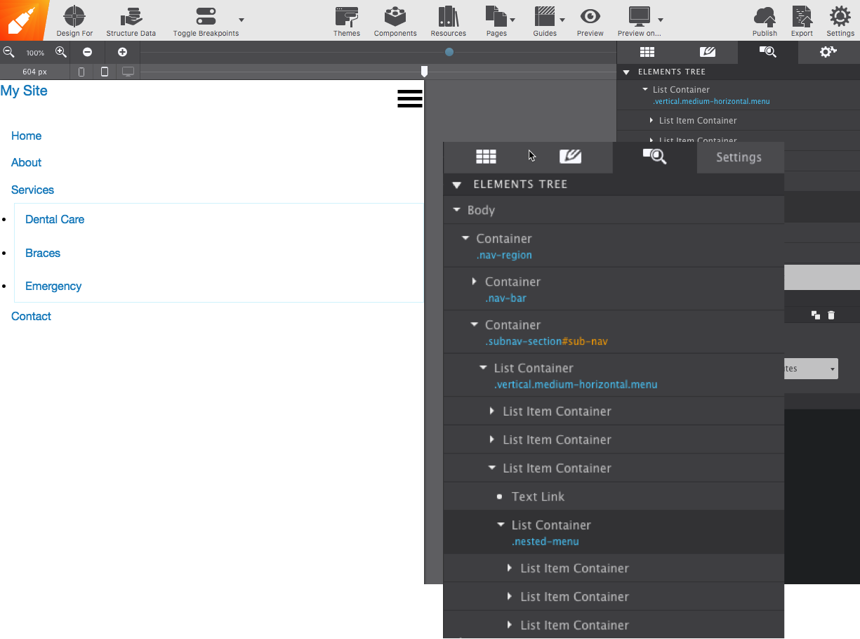
Give your new List Container element the vertical and menu classes. They are now on par with the rest of the links, only nested.
But what if we want to nest it one more time? No problemo, go back to the Content pane and drop a UL Link to the List Item Container. In this example, the UL Link is dropped within the 'Dental Care' List Item Container.
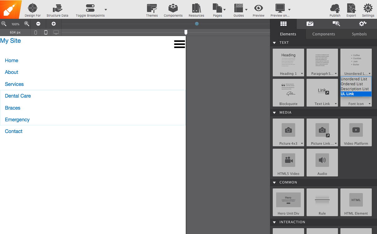
Each UL Link element will also get the vertical and menu classes.
Try it out within the browser Preview On to see the magic come to life…..
The Disappearing Title
If you want your site title to stay, one solution would be to add a Container to the nav-region Container that is configured to only appear on wide screens. Give the Container the class name desktop-title and insert a Heading element, replicating your website title and styling it appropriately.
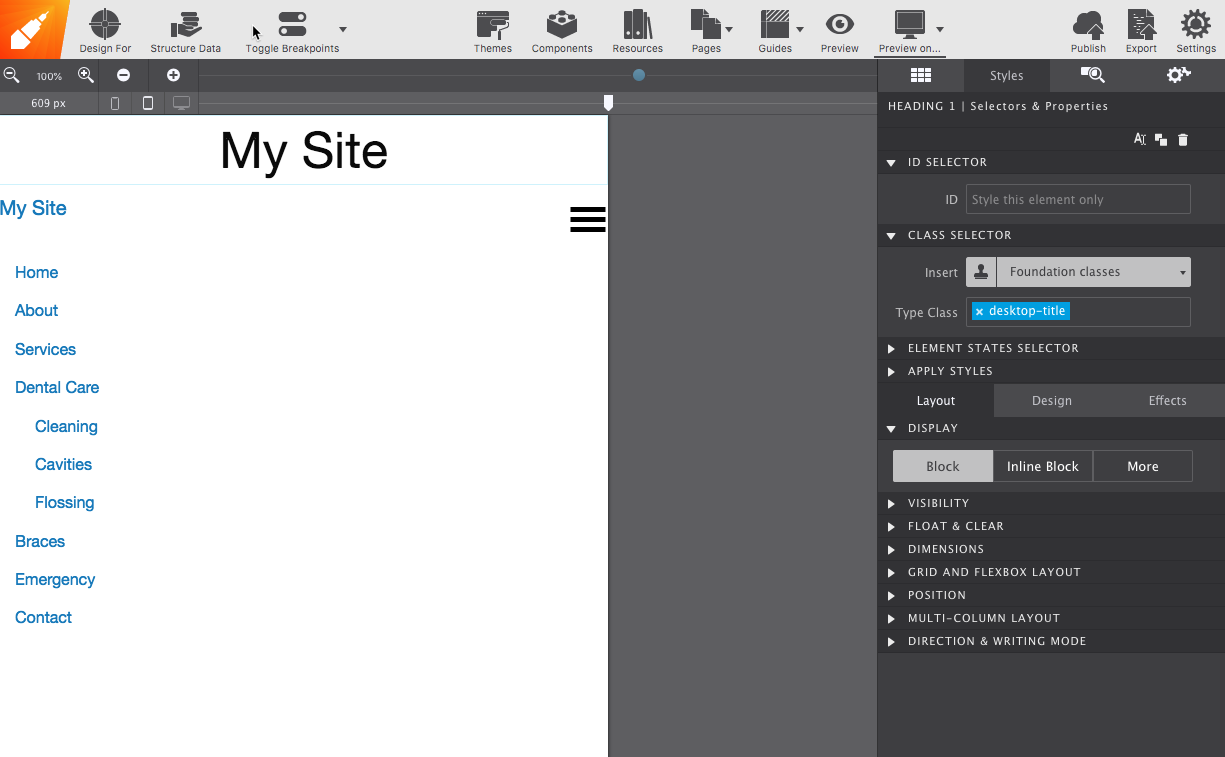
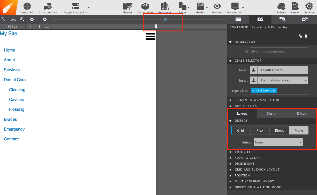
With the viewport slider positioned on mobile display (to the left of lowest breakpoint) select the desktop-title Container and go to the Styles pane > Layout > More > NONE. This will make the Title hidden on small screens.
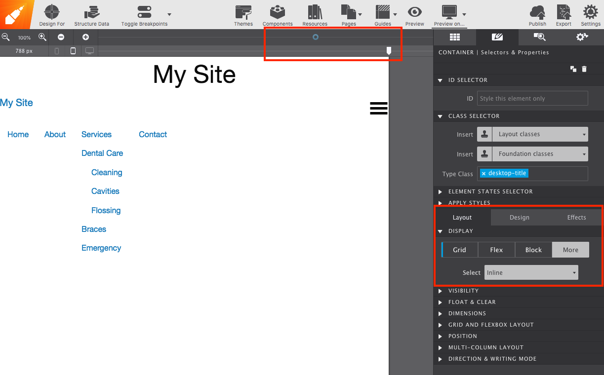
Finally, move the viewport slider to the right of the next breakpoint and change it from None to Inline. This will make the Title diplay on wide screens.
...and there you have it! Feel free to tinker with the styles such as width, size, color, ect. in order to reach the end result you want. If you want the menu positioned in the center for wide screens, it is a good idea to put a max width on the parent container and use Display > Flex > Center.
For links, give them all the same class name so that you can style them all at once. Download the Site Designer project file here if you'd like to dig into this example.
Note
There is a small issue that occurs whenever you try to customize an element that has a foundation attribute (our menu in this case). The style will appear and then when hovering over it will switch to Foundation's default colors (white and blue) When this happens, the solution would be to apply another class with the exact same styles to override the default.