

Adding the design layer with visual CSS3 controls
Content creates design atmosphere
The site we are constructing is for a good cause, a shelter for cats (and other animals). Sometimes it seems about half of the web consists of dancing cats, flying cats, birthday cats, drum playing cats and a whole bunch of like minded cats. Therefore a more serious cat note felt appropriate. Also, our very own @Suzie-Q spends her weekends volunteering at a local cat shelter, making her qualify for the domain expert role with ease!
Did not finish the responsive wireframe?
No worries, we got your back. You can download it below and use it to follow along with this article.
Whereas the initial template felt ‘general’ — now the specific topic and added production content determine the design direction. They clarify the message the sites needs to transmit and set the tone for the design atmosphere. This helps, for example, to make decisions about color schemes, determine what type of fonts to use, and find or create graphics that support the goals of the site. In this case we found a ton of pictures of sweet shelter inhabitants, so we we’re ready to hit the ground running by swapping out the placeholders for them. But we’ll get to that in the next step, for now we want to focus on the most attention grabbing part of the page.
Content and design for the callout components
Triple click the heading in the callout box and add our appeal to the visitor:
They need your help, love, & support
This clarifies what is expected from the viewer. However, to make this unambiguous we do need to clarify what ‘they’ refers to. One way this can be done is by adding a heart-warming background image of a furry occupant to the callout row. First, make sure the slider is to the right of the first breakpoint. Then, double click the row to launch the design pane, jump down to the background section and use the Image drop down menu to select an image.
If the image we want to use is on a local computer, we need to choose Resource to add the pictures. If the images are online, like the one in our example, we use URL to plugin the direct link. We’ll go over the steps in detail and provide you with a link in just a bit.
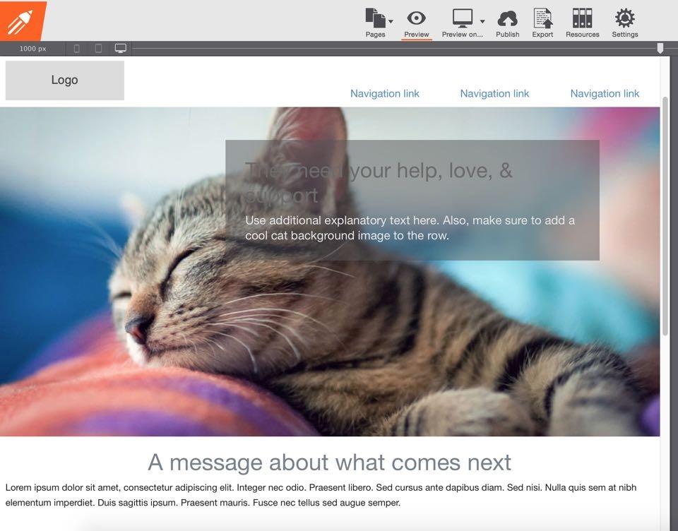
What a difference the right image makes! The purpose of the semi-transparent background on the callout container immediately becomes clear as well. However, the heading text is largely unreadable. Not a biggie, we just started working on the design layer and still have to choose a fitting font, a warm color scheme and need to add a bunch of other design details anyway.
Readying our design arsenal
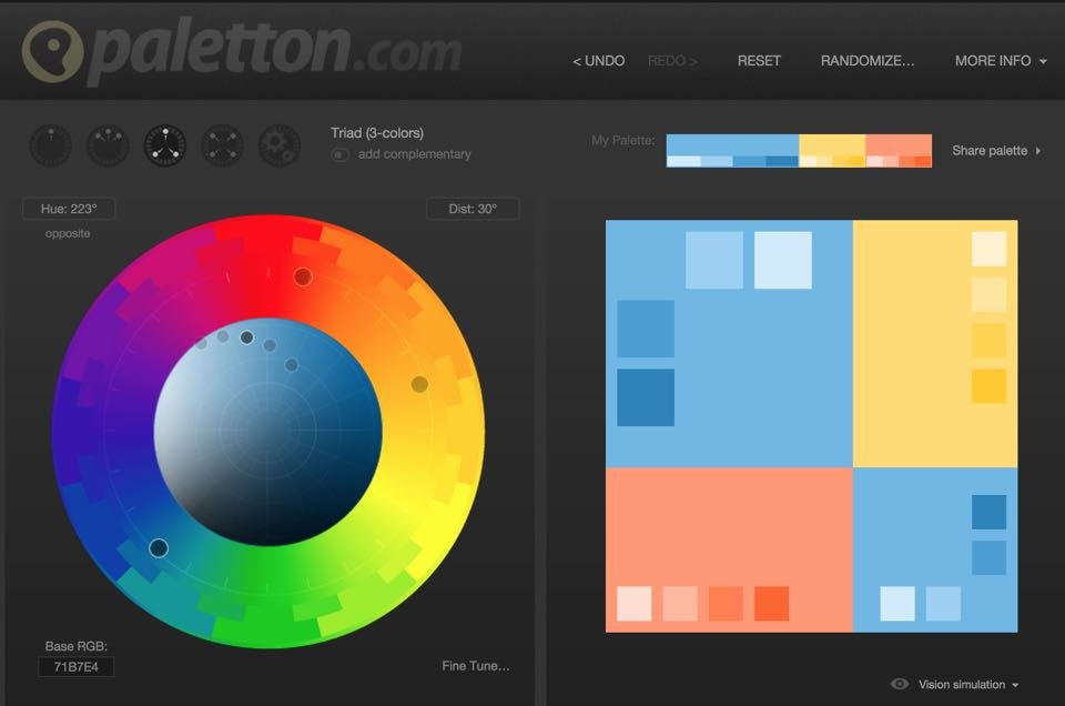
One way of creating a great color scheme is to use the picture as a reference. Using the blue and purple tints from the background picture, we built a pastel blue and off-white scheme. There are several tools that can offer great guidance in doing so. Our Web Color Schemer is one of them, but since that app is Windows only we are using the services from paletton.com here. Simply feed it with a base color and tweak to your liking to find the colors that enhance the theme of the design.
Selecting a fitting font, or more correctly typeface, for a project can be a daunting task. These days there are an overwhelming amount of choices, how can you be sure you picked the right one? Full of tips and examples, the internet comes to the rescue (as it does so often). In our case we were looking for a font that supports the atmosphere of the picture. A font that feels warm, inviting and not too serious. Browsing the Google font directory (the filters are a great help to reduce the available choices from close to 800 to a more manageable 100’ish) our design wizard Diego hand picked Chelsea Market — in just a bit you’ll see why.
With the color scheme and font choice added to our design arsenal, we can continue to beautify the important callout section. Starting with the container, we are going to change the grey background to a more fitting blue. With a gradient we can add purple and blue tones and make the right side of the container more transparent than the left — a triple win!
The heading font we change to Chelsea Market and make it white for improved readability. For the supporting paragraph we use a grey tint while giving link credits to the photographer who made this lovely image. With a few small additional details, this gives us the result below.
Cool? It all comes, together, the message, spacing, image, color scheme and font choice. Let’s do a little experiment: compare the feeling the heading message in the new font transmits, to the feeling transmitted when you copied and pasted it at the begin of this section. Totally different, right? Here are the steps in full detail, you’re invited to follow along:
1. Designing the callout row
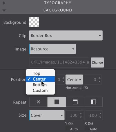
Make sure the callout row is selected. Then on the design pane, scroll down to the background section. Use the Image drop down to either link to the image locally or online. For linking to the online image select URL and paste in the link below:
http://cup.cm/1MXV88N
To make the image cover the entire row we are setting the Position controls to center and background Size to cover.
To show more of the background a Min-height can be added in the dimensions section — we used 600px.
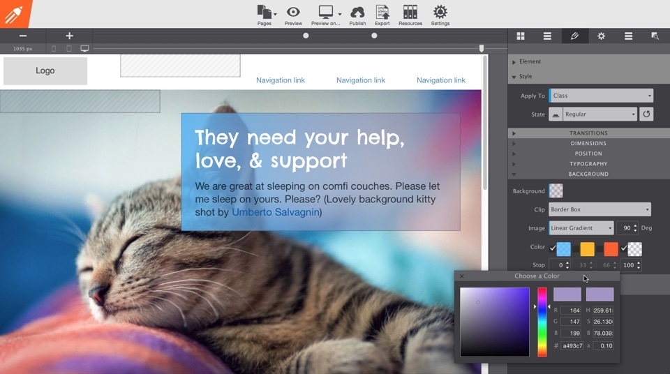
2. Tweaking the callout container
Select the callout container and, again, use the image drop down in the background section. This time we select the Linear Gradient. Updating the Degrees from 180 to 90 changes the direction of the gradient, from top-bottom to left-right.
We’re only using two colors. For the first we use #4ab7ff with an alpha value of 0.8. The gradient ends with #a493c7 and an alpha value of 0.10 (the values for this are visible in the color box in the big screenshot above). That looks pretty cool already, but there’s one more step needed to go from cool to awesome.
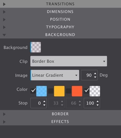
For that, click the Background color tile and change the color to #856a85 with transparency value of 0.3. This will create a purple’ish effect that makes the call out box fit even better on the picture background.
The background controls offer a lot of possibilities, so we dedicated an entire article to them.
3. Updating the callout text
Changing the font properties will be straightforward by now. Double-click the header and go to the Typography section. Start typing Chels… in the font drop down and the handy filter will only show you the applicable font selection. Please select our font choice, Chelsea Market. Then we set the size to 42px and change the color to white (#ffffff).
For the paragraph text we continue to use the default paragraph font in RSD, Helvetica. For callout text we want a bigger font though. We arrived at a font size of 22px, with black (#000000) and 0.7 transparency for color settings. We decreased the Line-height to 1.3

To add the courtesy link enter text edit mode (right-click > edit is another way of getting there). Select the part of the paragraph that will be used as a link, click the Plus button on the Link control and enter (paste http://cup.cm/1UnGcoV) the link in the URL box. Click Apply and scroll down on the edit pane to change the link color to #0058a6 with transparancy (alpha) value of 1. Mission accomplished!
With all that updating behind us we don’t seem to need the last column. Removing it creates space that allows us to control the width of the container in more detail. To remove the column, select it and click the X icon in the element section on the design pane. The span width of the column needs to be updated to 8 for the container to actually use the newly created space.
Following the span increase the container stretches to the right side of the design. To limit any endless stretching on large screens we can specify a maximum width. In the dimensions section on the design pane make sure you inserted 600px into the Max-width input box. With that, the container will still shrink on small screens. However, the callout text will not stretch beyond the specified value, preventing a long long line of text on big screens.
Alwyas check the effect of our content and design updates all widths!
It’s a really good habit to move the Slider on a regular basis. Following the previous changes you’ll note that past the first breakpoint (800px) the span width of the column with the callout container needs to be wider. Easy enough though, simply set it to 10 with the span width drop down.
When moving the Slider you’ll notice the little device icons on the left of the slider bar light up, and fade out. When passing the first breakpoint, they indicate that we’re entering the tablet area. Smaller devices such as tablets (and phones for that matter) are usually closer to the eyes than desktop monitors. This matters because it reduces the need for large fonts. And honestly, at the smaller width the fonts started to feel relatively large also on my laptop! Reducing the font size to 30px for the heading and 20px for the paragraph seems a lot more fitting here. Go ahead, make the change if you have not done so yet.
Where should the breakpoint be for [insert device name]?
One of the most common questions we hear is regarding the specific breakpoint position for mobile phones and tablets. The simple answer is: there is none! You see, the spectrum of devices sizes is huge. There are phones, phablets, tablets, tabletops...all the way up to television and project screens. All used for browsing the web and viewing email.
And then there is this scenario: someone could be viewing your website on a gigantic monitor, but using a browser that has been resized to some random dimension between a phone and tablet. Responsive design is not about designing for devices, it is about ensuring your sites look their best at any size.The device gage provided in RSD is just to give you a general idea of the audience viewing the page at that particular size.
Here’s another thing that caught my attention: the height of the callout row. Does the row seem high to you too at the smaller widths? To prevent unnecessary scrolling let's reduce the minimum height a couple of pixels. We made the jump from 600px to 450px — and beyond the second breakpoint we made another little jump, to 375px this time. Here the font size can be reduced a bit again, we are using 26px and 18px respectively.
If these sizes feel too big for you when entering the phone size area, feel free to add another breakpoint (add about 400px maybe?). Just hit the plus button and make any changes you feel will improve the design and usability. A nice visual tweak could be to make the callout container stretch to the sides of the screen. For that you can set the max-width for the container to none here. Then select the column and reduce the left and right padding to 0px. You see, once you get the hang of how this works, the possibilities are endless!
Wrapping up
The row that we want to be the center of all attention is looking good now. The main responsive techniques and functions in RSD will start to feel familiar by now as well. If you concluded that this is more work than creating a static fixed-width design, I am afraid that you’re right: designing for all devices is a bit more involved. I do am sure that part of that is the learning curve though. This was only the first component of the design that you finished for the full 100% — from prototype to a full fledged production ready design.
We’ll complete the other parts of the page in the next article. There you can also dowload the project we completed here; just in case you want to verify your settings. With what we learned, adding the content and design to the other page components will be quite a bit faster!
For any feedback or questions, you can message me on twitter. Or just leave a note in the vibrant CoffeeCup forums or our Facebook page. Want to share this article? Please help to make RSD known to the word and go wild with any of the buttons at the top of the page, Twitter, Facebook, Pintrest or Google+ are all good to me!