

We all know videos can be a very powerful tool in helping your visitors make a decision on what to buy or simply learn more on what you have to offer. Inserting these videos into Responsive Layout Maker is a breeze by following the steps we have outlined below. We know you can do it! ;-)
Demo 1: Responsive Video Example
Using the Be-You-Video-Demo layout, we will insert a video into your exported website from RLM. Typically most video sites do not offer responsive based videos as they come with fixed height and width in their markup. In this article, we will walk you through how to modify the markup they provide and customize it to become responsive within your layout.
Where should you place the video in your layout?
It is easier to manipulate a video that is contained within its own column. Having the video inline with other content can cause positioning issues.
Step 1:
Download and open the project file found here:
Be-You-video-demo.rlmpStep 2:
We need to add a custom.css file as we will be adding custom CSS in Step 9 of the article.
Click the Layouts Toolbar icon and then Manage Projects and select the index file and paste in the link to the custom.css file
<link rel="stylesheet" href="css/custom.css" type="text/css">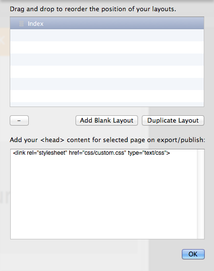
Step 3:
Retrieve the embed code from whichever service you are using (e.g. Youtube, Vimeo, etc.). We will be using Vimeo for this tutorial.
Here is the test code we will be using:
<iframe src="//player.vimeo.com/video/87861252" width="500" height="312" frameborder="0" webkitallowfullscreen mozallowfullscreen allowfullscreen></iframe> Step 4:
We are going to be replacing the image which we are using as a placeholder for our video, (named Our Video) with the embed code above. To accomplish this we, need to export the project by going to the File Menu > Export and export your project to the desired location.
Step 5:
Open your project in your favorite HTML Editor but you can use whatever program you like.
Step 6:
Open the index.html file and locate the “Our Video Image” in the code.
<img class="image-2-1 video" src="img/our-video-4x2.svg" alt="Image"> Step 7:
Delete the image’s code and replace it with your video’s embed code.
We also need to wrap the iframe code in a <div> so that we can manipulate it. When finished it should look something like this:
<div class="cc-video-wrapper">
<iframe src="//player.vimeo.com/video/87861252" width="500" height="312" frameborder="0" webkitallowfullscreen mozallowfullscreen allowfullscreen></iframe>
</div>
That is all that is needed to embed the video into your website. However, the video is not responsive, so we need to add some custom CSS to make the magic happen.
Step 8:
Next, create a new CSS file and save it as custom.css file inside the css folder that was exported from RLM.
Step 9:
Now for the fun part. ;) We need to define the cc-video-wrapper class we set in Step 7 and apply a few simple CSS rules to allow the video to be positioned within the cc-video-wrapper <div> allowing for a fluid width rather than a fixed width which adapts to the shrinking screen size.
Setting the cc-video-wrapper class to relative declares that all elements in that wrapper will position relatively to the wrapper it is contained inside of. The padding-bottom and height rule sets the dimensions of the box.
Finally, we need to set some rules for the <iframe> itself. By setting an absolute position we are telling the <iframe> that it can "take up" the space of its parents padding and height. To position the <iframe> within the parent element (cc-video-wrapper), we use top and left properties. Lastly, by adding width and height we obtain the responsive look we are after.
.cc-video-wrapper {
        position: relative;
        padding-bottom: 56.25%; /* 16:9 */
        padding-top: 25px;
        height: 0;
}
.cc-video-wrapper iframe {
        position: absolute;
        top: 0;
        left: 0;
        width: 100%;
        height: 100%;
}
To learn more about responsive videos head over to A List Apart and also CSS-Tricks.
Do you have Multiple Videos?
That is perfect! Simply repeat Step 7 for each of the videos you add to your page. If the video is on a separate page do not forget to link in the custom.css file as we did in Step 2!
Now that you have the steps and know-how try applying this to your own project!
Missing some settings?
This is because Responsive Layout Maker Pro was used for the creation of this article. One or more of the settings used here might not be available in Responsive Layout Maker. For the most part however, you can continue through the article adjusting the settings that are available to you.