

All the cool kids love the Design tab. This tab allows for background manipulation, color disposition, image refrigeration, border contortions, corner roundafication and shadow relocation. (Yes, we made some of those words up. :P)
Below you will find an outline for all the settings under the Design Tab.
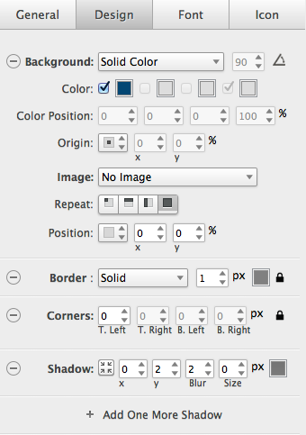
Background:
Under the background settings you can assign a Solid color, Linear Gradient or Radial Gradient to your button. Using CSS Gradients allow you to reduce download time and bandwidth usage by replacing an image with CSS!
Solid Color:
A solid color background is just that. You select one color from the color picker and this will display as the background color of your button.
Gradients:
To create a linear gradient, you first need to choose your color stops. Color Stops are the colors you wish to include in your gradient. In Button Builder you can define color stops by checking the box next to each color picker but you must specify at least two of them and can specify up to 4 more to create more complex gradient effects.
Next you need to add a direction, better known as an angle. Changing the angle of a linear gradient allows you to control which direction your gradient apples to your button. 90º (degrees) is the default settings as this tells the colors to display from bottom to top. 180º would be right to left, 270º would be top to bottom and 360º would be left to right. We recommend you play around with the setting to find which works best for your button!
For more information on Gradients and how they are used visit this article.
Color Position:
The color position settings is used to position each color starting position at a specified percentage location and is only used on gradients.
Think of your button as 100%.  The first color chosen is always going to start at the 0% location and the last color will always end at the 100% location. If you want more of that color to show you would need to change its position on your button. 25%, 50%, 75% and 100% are the best settings when using this feature however you can edit it to your liking.
Origin:
This is a new fanguled word for align. Using the Origin option you can align your gradient color left, right, top, bottom or even center it.
Image:
Want to use an Image as a background? Here is where you would add it! Click the + sign to add an image or use one of our default backgrounds.
You can also click the  icon to open the image options menu.
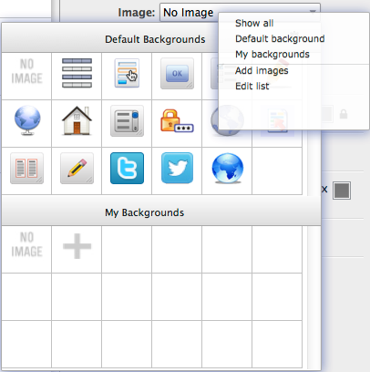
From here you can narrow down your search by filtering out your images. Choose the Default background option to just show the default backgrounds or choose My backgrounds to show the background images you have added to Button Builder.
To add an image you would select Add images and remove them using Edit Images.
Repeat
 Is the no-repeat button. This will tell the image not to repeat.
 This will allow the selected image to repeat on the x axis or left to right.
 Allows the selected image to repeat on the y axis or top to bottom.
 To have your image repeat over the entire button use this setting.
Position
Sets the position of the image within the width of the button. Your choices include manual setting of the image using the x, y (x is left and right, y is top and bottom) axis and top-left, top-center, top-right, center-left, center, center-right, bottom-left, bottom-center and bottom-right.
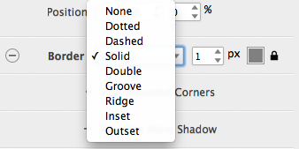
Border:
Allows you to set the border, border color and px settings of your button. You can also unlock this setting to set each border individually or lock them and make them all uniform.
- None - Specifies no border
- Dotted - Specifies a dotted border
- Dashed - Specifies a dashed border
- Solid - Specifies a solid border
- Double - Specifies a double border
- Groove - Specifies a 3D grooved border. The effect depends on the border-color value
- Ridge - Specifies a 3D ridged border. The effect depends on the border-color value
- Inset - Specifies a 3D inset border. The effect depends on the border-color value
- Outset - Specifies a 3D outset border. The effect depends on the border-color value
Corners:
Allows you to make your button with rounded corners! You can use the unlock button to set each corner individually or lock them and make them all uniform.
Shadow:
Want your button to pop? Add a shadow and control the shadows location by using the x (Left and right position) and y (top and bottom position) settings. Blur is the amount of blur you wish the shadow to display, increasing this number makes the shadow wider and lighter, decreasing the number makes it darker and closer to the button.
Add more Shadows
Only Peter Pan hates his shadow! We love them and with a click you can add more shadows to your button.