Design issue, looking for opinions

User 1892988 Photo


Registered User
151 posts

Well, I did put a web site up and is running smooth (beholdmyvision.com)

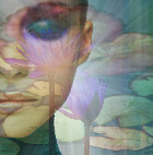
The design turned out to be different than what I had in mind. I'm into photography and do want to concentrate on Nude Art.

In my opinion, art sites need to be "serious" and "sober" with elegant fonts. What I have right now do not comply completely with what I had in mind.

However, it's not really bad looking neither.

Now that I start to know may way a little bit with CC software, I did rebuild the site complying with my first intentions.

This "make-over" is near to completion. To support my decision, I need your opinion about the appearance of the current site in comparison with the make-over.

Attached a screen shot of the new design. Please compare with beholdmyvision.com
Attachments:
HTML Editor, Visual Site Designer, Web Form Builder, Picture Gallery, Fire Starter,
News Reader, Web Access Manager, Password Wizard

asaruba.com
beholdmyvision.com
User 282670 Photo


Registered User
3,940 posts

I think I like the new, but then for me I would work the newsite in with the old, like make the new site a subdomain and link to that folder from the old site if that makes sense. ( my opinion) They are both good looking websites and it would be a shame to not use both to your advantage Dick. http://emoticons4u.com/fingers/fing10.gif
Might I also add very artistic as well!


User 355448 Photo


Ambassador
3,144 posts

Dick,

Since you ask for opinions...

I prefer the current site. The one in the jpg seems too dark.

User 244141 Photo


Ambassador
1,209 posts

Both sites have great designs. I think it depends on what market you want to target. Your first site expresses a broad range of services for the customer and works well at doing that. Your new beta site is geared more for someone looking for nude or adult(depending on your text content and site promotion). If I visited the second site and needed family photographs, yours would probably not be at the top of the list. However, if I was interested in nude photography, then I would give it a visit. It seems more adult sites than nude have black backgrounds. So you may have clientele looking for such.
Web Design: https://www.websnoogie.com
Member - BBB: Websnoogie, LLC


User 471275 Photo


Ambassador
1,130 posts

This is my personal opinion.

A good photography site should be in black. The reason for this is that the black background does not distract you from the picture. So I would make the whole site black. The button would be a shade of gray and the text would on the buttons black or white depending on the shade of gray. This will give the website style be it minimalistic the idea is less is better.

I would certainly not use flashy text colours as the main emphasis of the website has to be the pictures and flashy text colours cause a distraction from the images.

You could also consider using CC gallery for the pictures to give the picture pages style.

I would have a look at others photographers websites to get more ideas.

Hope this helps :)

User 1892988 Photo


Registered User
151 posts

Thanks you all so far folks.

I know these things are very taste sensitive.

ad99wd (Susan, Mary, Header, ?) knows where I want to go with this. However, I want to keep an open mind.

Alright...more opinions?
HTML Editor, Visual Site Designer, Web Form Builder, Picture Gallery, Fire Starter,
News Reader, Web Access Manager, Password Wizard

asaruba.com
beholdmyvision.com
User 1892988 Photo


Registered User
151 posts

The presented new design had still a "well...hmmm..uhh" factor, which is a sort of okay I guess but not okay enough.

I scrape it and started another design. Personally I like this better.

Most important is what you think of it. Your opinion is highly appreciated.

One important side note is my site will eventually only be concentrated on (partly) nude art. It will be a portfolio of art which I probably will use for commercial purposes much later in time.
Attachments:
HTML Editor, Visual Site Designer, Web Form Builder, Picture Gallery, Fire Starter,
News Reader, Web Access Manager, Password Wizard

asaruba.com
beholdmyvision.com
User 364143 Photo


Guest
5,410 posts

Both are nice. I think I like the layout of the new site better but I'm thinking the red text and links should be a little more in contrast to the darker background. Good job!
CoffeeCup... Yeah, they are the best!
User 1892988 Photo


Registered User
151 posts

Thanks Tom!

...but I'm thinking the red text and links should be a little more in contrast to the darker background...


I played around with the colors a bit but can't find something that look attractive within the color scheme of the site. I will certainly play some more...
HTML Editor, Visual Site Designer, Web Form Builder, Picture Gallery, Fire Starter,
News Reader, Web Access Manager, Password Wizard

asaruba.com
beholdmyvision.com
User 463058 Photo


Ambassador
1,073 posts

I would remove the notice about browser security conflicts as this may lead some to think there is content which could actually pose a security risk for them.

What is this in reference to? I'm sure a workaround would make your content work correctly with all modern browsers, as other sites don't give such warnings.

Have something to add? We’d love to hear it!
You must have an account to participate. Please Sign In Here, then join the conversation.