

About creating a web design, that fits all sizes
Hold on now, if it fits unlimited device and screen sizes, the web site must be like...infinite? Without predefined size, impossible to measure, boundless...?
Yup, that’s exactly the point. Only, this is far from anything we are used to. Especially in the context of “design”. Think about it, almost everything we create comes in fixed, predefined, dimensions. Everything, from phones, magazines, and soap bottles, to paintings, tablets and so on.

Objects that adapt—“respond”— to a specific context, is something that in our minds is only possible in books and movies. Exactly like the Harry Potter bus that automagically adjusts its width, so it can drive through alleys and in between other cars. That’s not real...or is it now?
Artists and painters have been working with fixed canvas sizes for hundreds of years. Graphics programs like Photoshop, now 25 years old and originally developed for print based design, brought the habit of using fixed pixel dimensions to the Web. Before a design can be started, a specific fixed canvas size will always need to be defined.
But mobile phones, phablets, tablets, laptops, desktops, second screens, televisions screens all come in different sizes. Yet they are all used to browse the same web, visit the same sites, fill out the same (web) forms, view the same pictures, make comments, share information and read (and respond to) the same emails.
(Image released under creative commons license on Flickr by David Catchpole.)
Responsive site designs are content-driven and based on intent
A dimensionless design is different and the workflow and creation process needs to reflect that. Being device-agnostic means that the first focus should be on the message, not on the packaging or decoration.
The pillars of a succesful responsive design are based upon, intent and content. This is very much in line with the Mobile First workflow advocated by the talented Luke Wroblewski. The design constraints (space mainly) of the mobile screen forces the creators to focus on the most important parts of the message and prioritize the content accordingly. Content-based prototyping, or content-driven design, are similar approaches in that the initial focus is on the intent and content of the site, absent any illustrative distractions.
In his book Responsive Design Workflow
Prototyping and wireframing in the browser creates more realistic expectations. However, hand-coding these designs can be time consuming, therefore limiting flexibility and creativity.
Apps like our own Responsive Layout Maker solve this problem. In a real browser environment, content blocks like paragraphs, buttons and placeholder images can be dragged into place. Wireframe-like styles can be applied to all elements, classes and IDs.
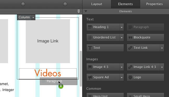
Texts can be edited, allowing for prototyping with—or even, as we at CoffeeCup do, creation of—real content. The use of a responsive grid with a viewport slider allows for viewing the content at every possible width. Custom breakpoints with layout related style controls guarantee the truly device-agnostic design. Here’s something to keep in mind:
If you’re designing for all devices, you’re really designing for no device.
(Not sure if I read this in some way or form as I read a lot about this stuff and can't track back a source. If you happen to know the source, please drop me a note on twitter so I can add the proper credits. If not, I will happily take some credit...)
Building the foundation of the site absent illustrative distractions in an infinite context, forces the focus to be on the intelligibility of the core message and content structure. This can be an intense process, but one that creates authentic sites. These sites perform better than designs created following the decorative or “fill up the empty space” approaches. Web standards pioneer Jeffrey Zeldman phrased this really well when he said:
Content precedes design. Design in the absence of content is not design, it's decoration.
The technical aspects of responsive design
Believe it or not, the techniques that fuel responsive web design are actually not very complicated. A responsive design usually starts with a flexible, so called fluid layout. If you think of a fixed, static website as a solid brochure or magazine always being the same size, then a fluid layout is easy to imagine: it proportionally grows and shrinks depending on the available space for displaying it.
Individual page elements, like images, can still be constrained by certain width (and sometimes height) boundaries — they only grow and shrink within the set limits. However, since they can also change position, a chunk of text may be placed below an image instead of next to it, the overall design does not necessarily correspond to any fixed dimension.
In short, a responsive website ‘responds’ to the available screen width. Not by making everything unusably small, but by serving a layout where every single piece of content has enough room to be readable and operable. Cool? Absolutely! Valuable? Very very very valuable!
Responsive design boosts all metrics
The web is full of case studies and articles on how responsive design positively impacts traffic growth, conversion rates, revenues, and overall visitor satisfaction. Many studies even report a double digit growth on these, and other important metrics such as visitor engagement and duration. Digital creation agency Electric Pulp published an excellent case study showing that for O’Neill Clothing, conversion rates were up over 20%, and revenue increased by 41% on non-mobile devices. With conversion rate increases of over 65% and revenue growth topping 101%, the numbers look even more victorious for mobile devices! With the fast growth of mobile internet traffic, none of this will come as a surprise to you.
Responsive design does not only have a big impact on website and landing page metrics. With a reported 65% of all emails 1st opened on a mobile device towards the start of 2014, responsive email design has the potential of having a huge impact on email marketing and newsletter sending as well. When email text and images are unreadably small, when links and buttons are unclickable, what will you do? Are you going to take the effort to zoom in and — navigating left, right, bottom, top — stumble your way through the email, desperately seeking for something that might interest you? Or do you simply delete that email? I know I do...
Emails that are not responsive are cumbersome to read, navigate, and act upon from a mobile device. Many prospective readers will simply delete these emails from their inbox right there and then. Instead they choose to spend their valuable time on that other email. The one that is immediately readable upon open. The one that, with a simple swipe, allows for an easy scroll down to scan or read the content. The email that contains buttons and links for easy clicking, just in case something needs to be checked out. The open, engagement (‘read’) and click-through rates of responsive email campaigns are better, and for good reason.
So, a responsive design is clearly the way to go, both for sites and newsletters, but how to pull that off? How to create a responsive site or email design?
Options for creating a responsive design
Entire books have been written on workflows, strategies, and implementations that best fit or support the responsive design challenge. Don’t get me wrong, these books contain a lot of good information and are all (well, almost all...) worth your time. However, when creating the actual site or email it comes down to three basic options:
- Hand coding (fun times!),
- Use a responsive framework,
- Work with a responsive design tool.
These options are not mutually exclusive. You can for example start with a responsive tool, and hand-tweak the code at the end. Some tools or apps work with a responsive framework underneath. And using a framework requires hand coding (if no app supports that framework).
The use of pre-coded or pre-designed templates can kick-start each of these alternatives. However, since responsive design is (should be) based upon the intent and content of a specific project, they should be used with caution. Intent can not always be conveyed through, and content not always be ‘crammed’ into, something made for general purposes. Consider them good friends for learning and training, then apply that to your unique design situation.
There’s a lot to say about each of these options. Related to the 1st option, a number of books have been written that address the fundamental (code) structure of responsive site design. However, very little has been written about hand coding responsive emails.
Hand coding a responsive email is way harder than coding a responsive site
Remember the days when a site had to be IE6/7 compliant? Octuple that effort, test like crazy and still keep your fingers crossed when sending. In the absence of “email rendering standards” coding them is much much harder than coding a responsive website. Currently Responsive Email Designer is the only viable option for creating custom responsive emails. Alternatively, you can try using a responsive email framework such Ink, or a responsive template. Bear in mind that any adjustment, and often even adding the content, will require a significant effort.
For those willing to sacrifice more customizability, Email Design Tools from email sending companies such as MailChimp or Campaign Monitor can be an option. However, to prevent the emails from “breaking” in some email clients, design and layout options are restricted. In addition most templates these tools work with are not responsive.
Back to responsive website creation. Here, despite the absence of written literature, frameworks are immensely popular. For some they provide speed, for others a good reference of how things could be done. As mentioned before, learning and applying that to a specific design case is the recommended course of action here. Relying too much on a framework comes with several big drawbacks, including sameness: an undesirable similarity in look & feel between sites created with the same framework. As Brad Frost states in his excellent piece labelled ‘Trouble in framework paradise’:
If Nike, Adidas, Puma, and Reebok were to redesign their respective sites using Bootstrap, they would look substantially similar.
This would certainly not create the authentic, successful, visitor experience we discussed before and should be aiming for. Certainly, customisations are possible, but usually sooner than later the provided structure will be a hindrance instead of a help. Just ask anyone who has tried to move the default breakpoints, or create their own, in the popular Bootstrap framework.
So responsive design tools are the answer? They can be, but not any tool and not for everybody. Let’s start with the tool part. To create authentic, custom sites, the tool has to offer sufficient layout & design freedom. There are not many tools out there (less than 6 probably) that can create production ready sites. Of those only a very few offer the right amount of design freedom with granular style control and critical responsive elements such as custom layout changes at breakpoints and swappable images (the picture element, yea baby!).

Responsive design tools may not for everybody because hand coding always offers that additional level of flexibility. However, it probably comes at the cost of speed and, since fewer design scenarios can be explored, can actually limit creativity. With the ability to add custom HTML, link in stylesheets, and availability of several hooks, Responsive Site Designer offers a good balance. However, right or wrong, for the very skilled a tool (or framework) will always be perceived as a hinderance.
If you have responsive design experience, whether through hand coding, using frameworks or tools, we would love for you to take Responsive Site Designer for a spin and shoot us some feedback. Stellar sites have already been created, but as it goes with apps, there’s always something to wish for and the current functionality is not final. Additional killer functions are being worked (pssstt.... shareable components anyone?) on as we speak but we’d love to get your input for fresh ideas and prioritization. It will help us make RSD better faster!
If you’re interested in kick-starting your responsive design skills today I have 3 recommendations:
1. Get the tools that can teach you: With Responsive Layout Maker Pro you can learn the ropes, without hand coding — the app will teach you how to design responsively as you go. Drop content elements on the layout, change the display width using the slider and update the layout configuration . This is the only app that allows you to customize your layout design at every single pixel and produces production ready code. Without decorative distractions you are bound to follow the right steps and learn fast. The design layer can be added later in Responsive Site Designer.
2. Read a few good articles about responsive design: You can’t go wrong with the article that started it all. Before most people even recognized the problems caused by the coming (indeed — coming — the article was written in 2010!) explosion of mobile internet traffic, Ethan Marcotte, speaker at our notorious Web Jam Sessions, proposed an approach which he labelled ‘Responsive Web Design’. The solution Ethan formulated consists of a collection of design techniques for creating websites that are easily viewable and usable, independent of screen size or device.
3. Do it yourself: Also highly recommended is our article series starting with ‘ Practical Responsive Design’. It’s a step-by-step mini course that will guide you through the process of creating an actual responsive website yourself. It should take you about an hour or 2 to create a cool responsive design that looks like this.
I hope this helped to create a better understanding of what responsive design entails, and how critical this is for every site (and email). Which of the above options you try or use, is totally up to you though!
About CoffeeCup and the responsive web
We at CoffeeCup have both a large and well trafficked site (yup, thousands for both...), yet a small team. We use the (responsive) design and update experience of our site, together with a lot of research, discussions with inspiring design agencies and great client feedback, to create software and articles for the responsive web.
For some, our tools will create the possibility to design responsively. For others these tools will help to build in the browser earlier in the process, and therefore be more creative through iteration and flexibility. We have created and will continue to write articles that explain concepts, help solve practical problems, or explain functions within our tools. If you like to write, have a good grasp of responsive design and would like to be featured on our site, please drop us a note.