

Web Form Builder is the first form program in the world to offer responsive designs. What's "responsive," you ask?
A responsive web design is one that responds to the size of the screen displaying it. They compress, scale, rearrange, and swap out design elements to optimize the layout of your form. For example, a form that's 600 pixels wide will view perfectly on a typical desktop or laptop monitor. But when that same form is viewed on a mobile phone (with a screen width of only 480 pixels), the design automatically adapts to be 480 pixels wide and changes its layout to look perfect at this resolution as well. Neat!
Take a look at these two different displays:

On the desktop computer, the form appears wide and full, very much the way you'd see it in Web Form Builder while creating it. But when the same form is viewed on a mobile device with a much narrower screen, things change: the text wraps into neat paragraphs, the fields shift around a bit to be easier to use, and the labels move from left-aligned to top-aligned.
Try it for yourself! Go here to see that form in action, and resize your browser to make it really narrow. Notice how the form automatically rearranges the elements as you change the browser size?
If you have responsive themes, they'll be labelled as such in the Theme Browser. To see all your responsive themes at once, select Responsive Themes from the Show drop-down in the Theme Browser.
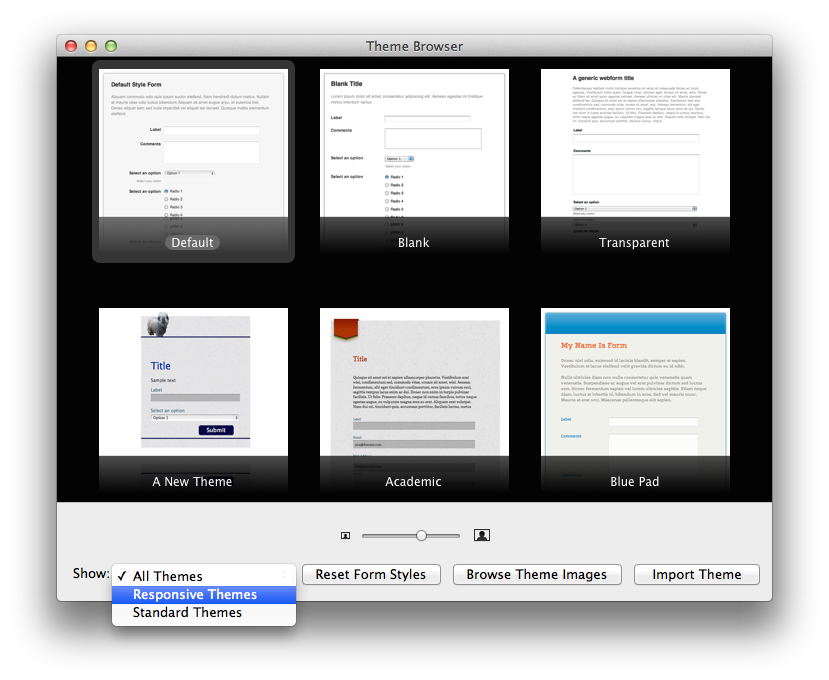
Please note that you must use a responsive theme to have a responsive design. If you don't have any responsive themes, or want more, you can get them in our form theme store.
Embedding a Responsive Form
Responsive themes look and work perfectly when they're used by themselves, but you can embed them, too. Of course, if the webpage they're embedded in isn't responsive, the form won't be, either!
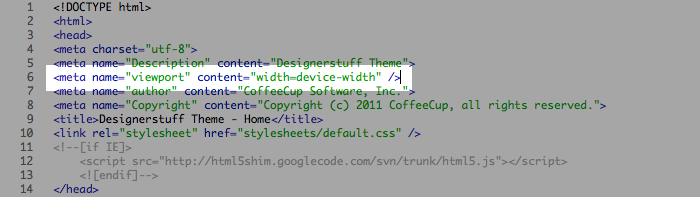
There's more that goes into making a webpage responsive than can be discussed here. We'll have many resources on this coming in the very near future. But just be aware that your form won't be responsive when embedded unless the page it's embedded in has this "media query" line in the <head> of the document:
<meta name="viewport" content="width=device-width" />
So you can see it in context, this code is in the <head> section of all our responsive editor themes:
So just remember: if your webpage isn't responsive, any forms embedded in it won't be responsive either. This includes sites made with Visual Site Designer, which have exact, fixed dimensions and do not respond to media queries. If you'd like to build a responsive website right now, you can check out the responsive editor themes and use The HTML Editor to create your new responsive site and embed your forms.