

In this article, we are going to walk you through how to apply a transition and an effect to a Button Link element. This is accomplished by adding some transition and effect properties to the hover state (when you mouse over something) and the regular state (what you normally see on the page).
While this article focuses on button links, the same process can be applied to any element within Responsive Site Designer.
Download ProjectCreating the Left Button
The first thing that you will need to do is to create the buttons. You do this by creating one button, and since the second button shares many of the same styles with the first, you can duplicate this first button to create a base style for the second button.
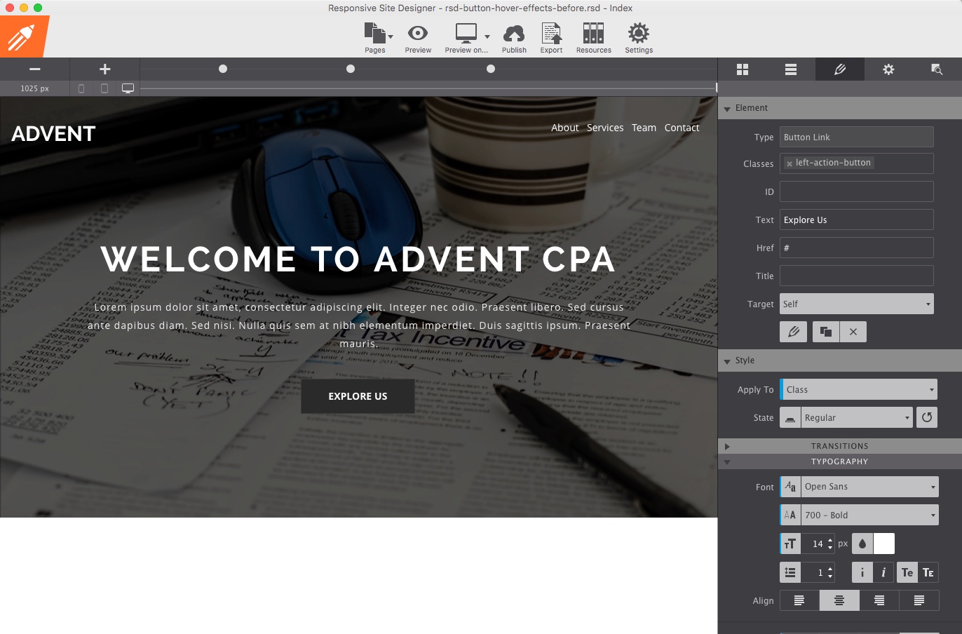
- Add a Button Link element to the empty column in the project.
- Add a class name of left-action-button.
- Remove the Button Link text and replace it with Explore Us.
- Change the font to
Open Sans. - From the font weight drop down, choose
700 - Bold. - Decrease the font size of the button to
14px. - Select
Uppercasefrom the Transform control to change all letters to uppercase. - Change the right and left padding to
40pxto add some space. - Add a margin right of
0.5%. This will push the right button (once added) away just a little bit. - Scroll down and expand the background properties and change the background color to
#2a2a2a. - Reduce the Radius X & Y controls to
0removing the rounded corners. - Under the State drop down choose
Hover. - Select the font color control and change it to
#2a2a2a. - Change the background color to
#ffffff.
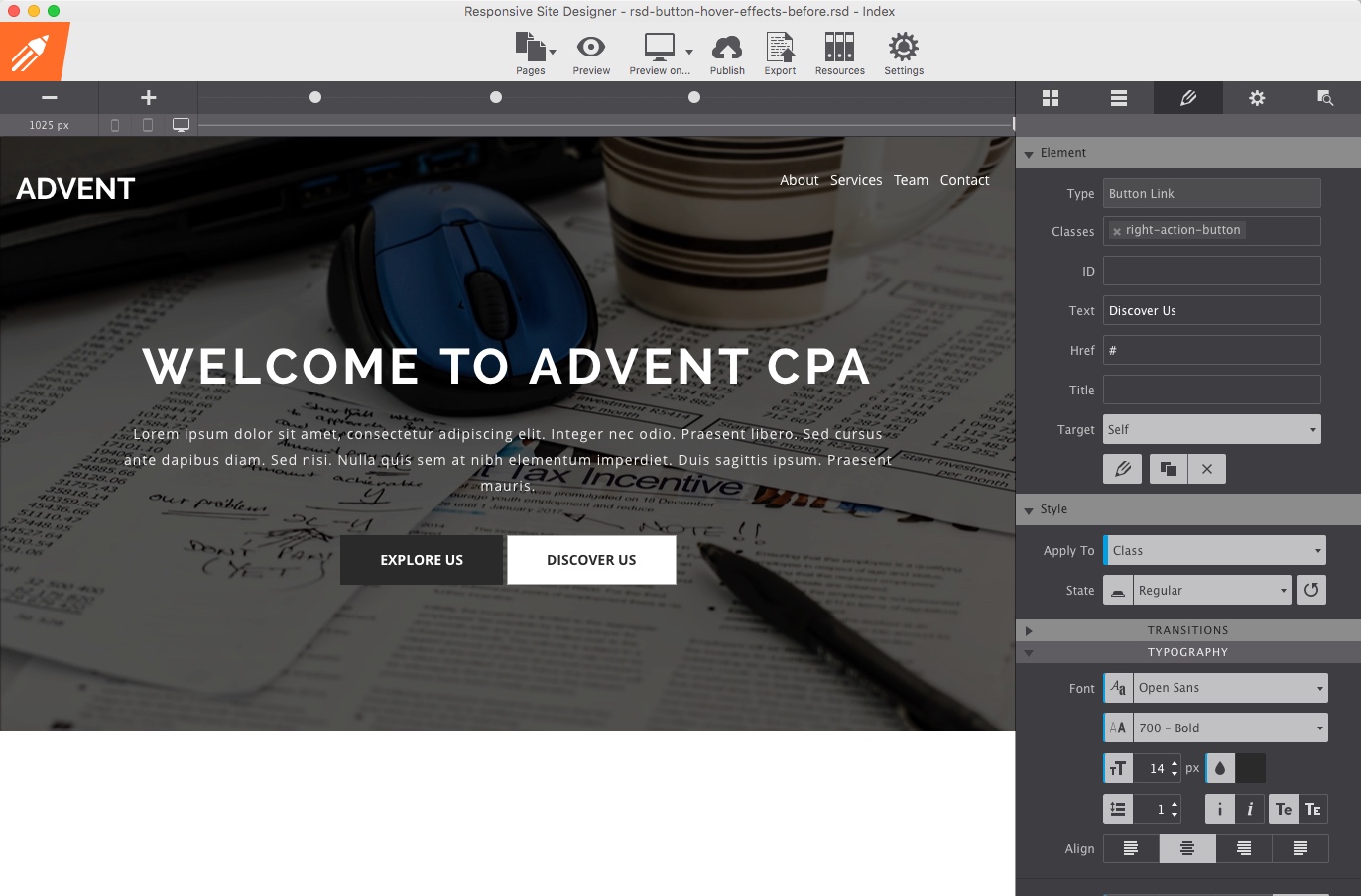
Creating the Right Button
Now that you have created the first button, you can duplicate it and make the needed changes to the right button class.
- Select the left-action-button and duplicate it.
- Remove the left-action-button class name and add a class name of right-action-button.
- Remove the Explore Us text and replace it with Discover Us.
- Change the font color to
#2a2a2a. - Remove the margin right of
0.5%, as nothing sits to the right of the button. - Scroll down and expand the background properties and change the background color to
#ffffff. - Under the State drop down choose
Hover. - Select the font color control and change it to
#ffffff. - Change the background color to
#2a2a2a.
Always use a class name
By defining a class name, you can re-use all the settings applied for other button links that you create, simply by applying the class name to it.
Adding a Transition to Regular State
Many people have asked why it is important to add a function and duration to the regular state. The answer is simple. When someone hovers over the button, they will see the hover transition, once they move their mouse away from the button, it returns to the regular state. If no styles (function and duration) have been applied to the regular state, then as they move their mouse away, the button would instantly change to the regular state again, rather then slowly fading back.
- Select the Explore Us button and go to the Design pane.
- Under the State drop down ensure
Regularis selected. - From the Transitions Apply To drop down, select
All. This will apply all changes made to the styles (background and color) on the regular state. - Under Functions, select
Ease-outso the background and font color fade back and forth. - Then set a Duration of
0.4to ensure the transition happens quickly. - Repeat this process for the Discover Us button.
Adding the Transition to the Hover State
Now, that you have the regular state styles applied, we can move on to the hover (mouseover) state.
- Select the Explore Us button and go to the Design pane.
- Ensure that you have selected the State drop down and have chosen
Hover. - From the Transitions Apply To drop down, make sure
Allis selected. This will apply all changes made to the styles (background and color) on hover. - Under Functions, select
Ease-in.which will make the applied styles fade in. - Set the Duration to
0.4. - Repeat this process for the Discover Us button.
Adding an Effect to the Hover State
Adding different effects can enhance a design. Below, we are going to add a simple effect that causes the button to grow slightly in size when moused over.
- Select the Explore Us button and go to the Design pane.
- Ensure that you have selected the State drop down and have chosen
Hover. - Scroll down and expand the Effects section.
- We want the button to grow in size slightly when moused over. To do that we need to adjust the Scale properties to
1.04. - Repeat this process for the Discover Us button.
See it all in action from beginning to end!
Success!
You have now added some cool effects and transitions to a simple button link. Remember, the same process can be used on any element in RSD (not just buttons).
Download Completed ProjectA big shout-out to Mansour, for the inspiration in creating this how-to article. For years now he has been creating some awesome video tutorials for our responsive applications. Thank you from all of us for your undying support!
For any feedback or questions, you can message Scott or Adam on Facebook, leave a note in the CoffeeCup user forums, or on our Facebook page. Want to share this article? Please help make RSD known to the world by sharing it on any (or all) of the buttons at the top of the page, Twitter, Facebook, Pinterest or Google+.