

Adding new pages to an RSD website
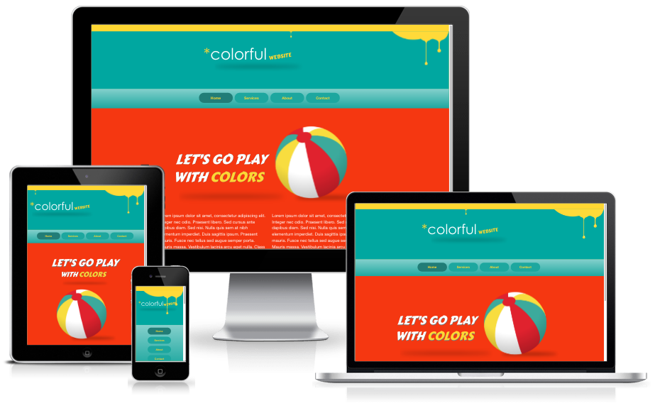
In my previous tutorial, I illustrated how easy it is to rebuild a Visual Site Designer page into a fabulous, mobile-friendly design using Responsive Site Designer. Here I am going to show you how subsequent pages can be created fast by reusing components and style classes. If you’re just joining me here, I would recommend first reading how I built the Colorful homepage. It will make navigating the waters for this tutorial much easier.
Adding & Duplicating Pages
New pages in the project will be pretty easy to complete since the header, footer, and navigation rows are the same on all pages. They can simply be copied and then pasted into place. In the near future we will be able to link these common elements so an update on one page is replicated everywhere...but that is for later!
For now we’re going to duplicate an entire page, and change or remove element that are different. The fastest way to add a new page is to click the Pages button in the top menu and select Duplicate Current Page. This will add a new page called Index_1. To change that page name, click the Pages button once again, and select Manage Project from the drop down.
The Manage Project section will allow you to view all the pages in your site, add new pages, duplicate pages, delete pages, and even re-order and rename pages. Double click Index_1 and change the text to services.
Updating the Navigation Row
To indicate to the viewer that the Services page is active, we’ll need to add the active class to the appropriate button. You’ll see the Services button darken. Then select the Home button and remove the active class from the button from within the Design pane.
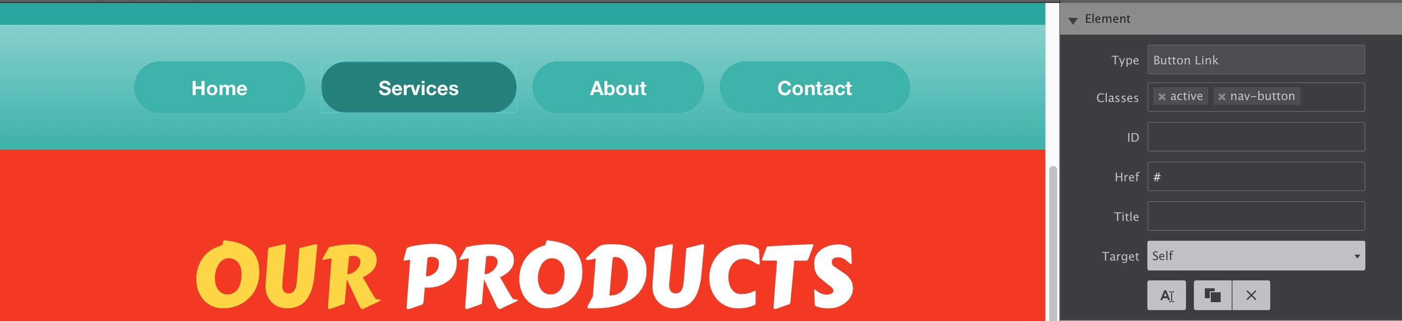
Main Row
The bulk of the changes will be made on the main row. Let’s first add a new row and from the Layout pane, give it class main-row. Use the directional arrows to move the row up (or down) so that it is positioned below the navigation row. We’re going to copy a few elements from the row with the beach ball, so for now we’ll ignore it and delete the row at the end.
Drag and drop a subgrid element into the column and give it a class name main-subgrid then restrict the Max-width to 1000px. Center this subgrid using the margin Auto checkboxes.
Next, drop in a Heading-1 element and give it a class name products-heading. The typography setting including the font type Carter One, with white FFFFFF font color, and aligned center. I also made the font size 87px. Now to personalize the text, triple click the text and change the words to say ‘OUR PRODUCTS’. With your mouse, highlight the word ‘OUR’ and set the color to yellow FFD733.
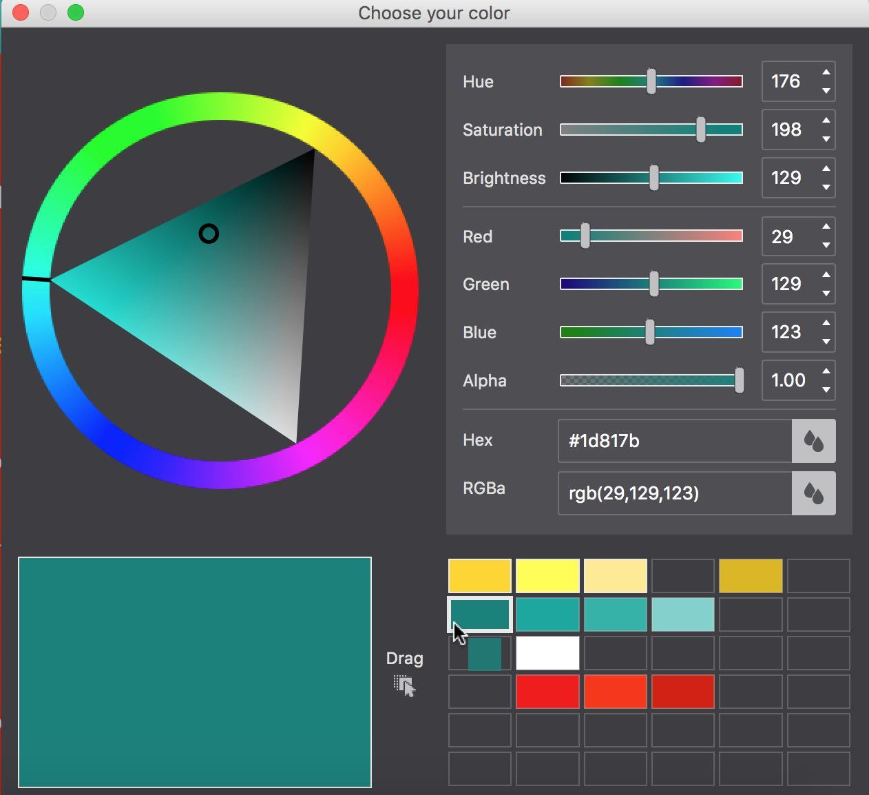
Coordinate colors with your palette
Saving colors to your palette as you work will help you keep organized. Instead of trying to remember the oodles of color combinations you’re using in the design, just click the small color box and drag it into the right side to save the color for other uses.
The two lower subgrid columns are identical so these will be easy to configure. First, add a Heading-2 element to the left subgrid-column and triple click to change text to ‘Awesome Products’. Set the color to yellow, font size to 24px, and align the text to the center. Hit the duplicate button and drag the copy into the right side subgrid-column. Then change the text of the duplicate to ‘Fantastic Service’.
Here is where I do a little cheating. We need to add paragraphs into the two subgrid columns. Instead of adding a brand new paragraph element, I just dragged up the paragraph from the lower row (duplicated from the homepage) and hit the duplicate button  until I have two paragraphs in each subgrid column. I also did the same for the ‘Read More’ text link.
After I moved these elements up to the new row, I can delete the lower homepage content row (bye-bye ball and intro text). Boom — the main section is done and ready for responsive tweaking!
Apply Some Responsive Magic
Grab that trusty slider and review the changes at the current breakpoints. First thing I notice after activating the first breakpoint is the products-heading is way too large. So I lowered the font size to 67px. Looking down the page, you’ll notice that the main paragraphs automatically adjust to a smaller font at the breakpoint. This is because when we copied it, all of its styles carried over too.
Continue sliding to the next breakpoint. I changed the large heading again to a smaller font size of 45px. The paragraphs are squishing together too much to look nice, and would display better stacked. To set this layout adjustment, select the left subgrid-column. Then, on the Layout pane, change the spans to 12. Repeat for the right subgrid-column.
The About Page
These next two pages are very similar and will require repeating most of the steps we covered above. I’m going to take a bit of a creativity licence to jazz up the pages.
Starting with the About page, we’ll need to add a duplicate page and rename the page about. If you forgot how to do this, jump back to the duplicate page section for a refresher on the steps.
With the active status of the navigation button at the top. Then we’re ready to manipulate the layout for the main section. The main heading is changed to say ‘WHO WE ARE?’ with the ‘WE’ in yellow font color. The two smaller headers are deleted as well as the ‘Read More’ text links at the bottom of the paragraphs.
With the last subgrid column selected, I add a new subgrid column to the main section. This new column will hold an action button. Drag in a Button Link element. The original theme has the button shifted to the left of the screen, but I think it stands out more when centered. With the button selected, scroll down to the Position controls and select Display Block. The button will be pretty long at this point, stretching the full subgrid-column.
Triple click the button in the live preview and change the text to ‘CHECKOUT OUR COLORFUL STORE’. Highlight the ‘CHECKOUT OUR COLORFUL’ and change the font color to FFD733. Click out of the inline editor to start applying styles. First, change the font type to Carter One, font size 25px. Scroll down to the background section and change the button background color to green 1D817B. (Yes, the original had a light red color but I think the darker hue makes it really stand out.)
Next, let’s shorten the width of the button since it looks ugly at such a huge size. Under Dimensions, set the Max-width to 300px and center the button using the Margin Auto checkboxes.
The original theme had a mouseover effect on the button, from red to light red, I deviated a bit on the colors. From the Design pane, select State Hover. Then scroll to the background color and change it to F1614F.
Using the slider, I view the design at the first breakpoint, and I decided to lower the button font type to 20px. At the second breakpoint, I change the button font size to 17px.
Practice Time with the Contact Page!
This page is practically identical to the About page when it comes to the main section. So I invite you to practice adding and styling this final page. Responsive Site Designer gives you a wide range of elements to develop your page. Combine them in any way you see best to share your message. Experiment with new layout combinations, organize elements in various ways, tweak colors — go wild!
I hope you enjoyed my tutorial! I sure had fun and learned a lot in the process. If you’d like to be notified when my next tutorial is complete, let’s be friends on Twitter and I’ll keep you in the loop. If you’re ready to conquer another theme with RSD, check out the video demonstrations Bob made one rainy Atlanta weekend. :)