

You may be asking yourself what really is a Responsive theme and why do I need one? Well a responsive theme is a process of web design that allows a website designer to restructure a website at specific break points across various screen resolutions, and platforms such as tablets or mobile phones.
What this means for you is that no matter if someone is sitting at their desk at home or busy and on the go they have access to your website in a layout that is easy to read, view and navigate from whatever device they are using. This makes it easier for them to access your content anywhere, which means more traffic to your website! 

As you can see in this example when the website is resized the page structure changes to meet the size of the browser. Pretty much the same way as it would do on a tablet or cell phone. This is done by using certain break points where the theme changes to a new layout. The most common of these break points are 480 pixels and 768 pixels.
The width of most smart phones is 480px, whereas 768px is the size of most tablets. By adding the following to the CSS the designer can then modify the layout only when the browser reaches the break points in width.
@media screen and (max-width: 480px) { }
@media screen and (max-width: 768px) { }
Want to know which of our programs work with responsive layouts or include responsive themes? Well you are in luck! We have a list right here!
 The HTML Editor
  Responsive Editor Themes
 Sitemapper
 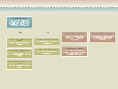 Responsive Sitemapper Themes
 Web Form Builder
 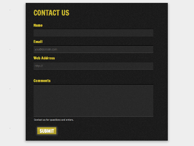 Responsive Web Form Builder
Now before you ask we are working on more responsive design themes and programs as 2013 is the year for responsive design!